
A hot identity with a cult following.
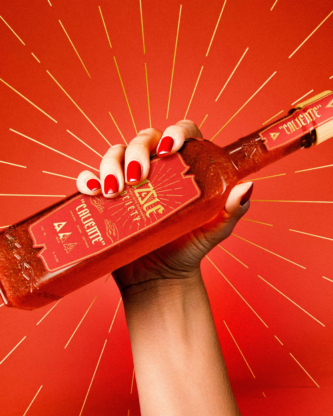
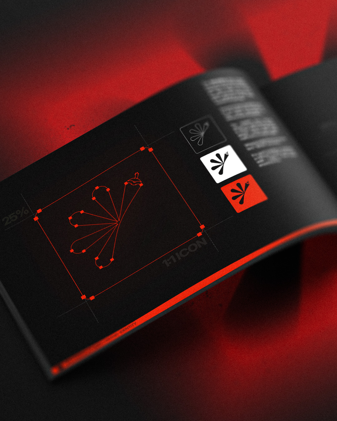
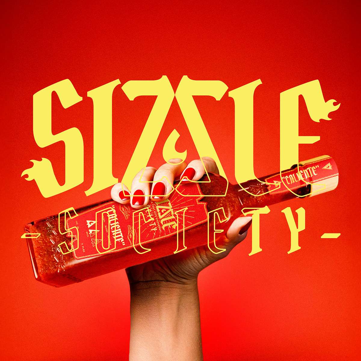
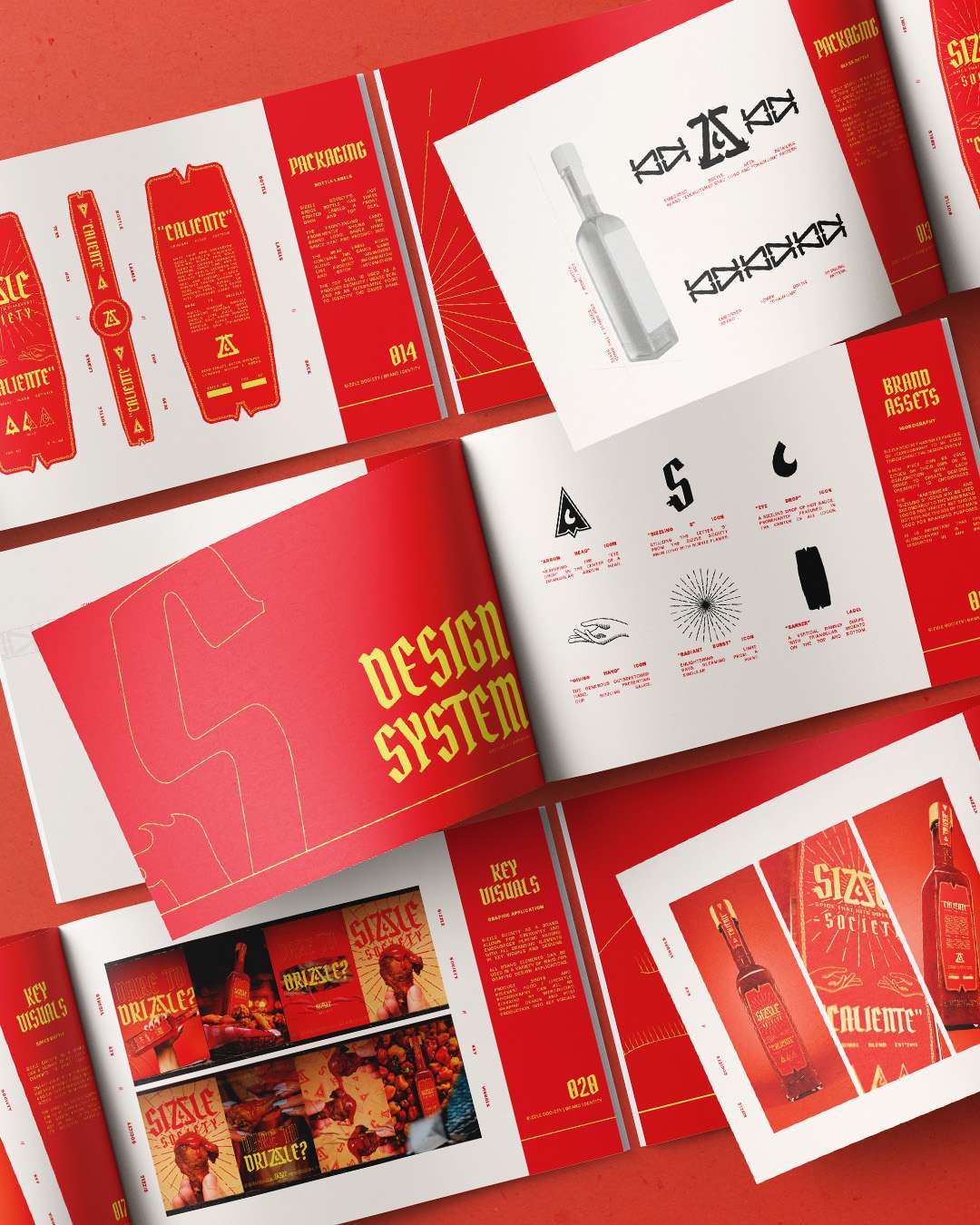
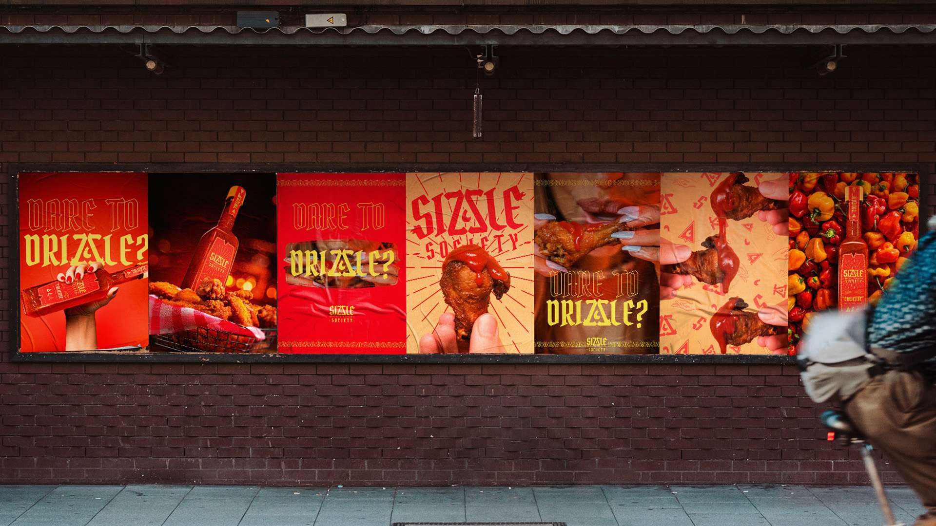
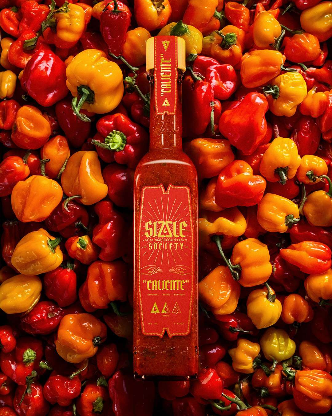
Sizzle Society needed an identity that captured the intensity of its hot sauce and the unconventional personality behind its name. The brief was to introduce its flagship blend with a distinctive visual presence, balancing bold expression with clear product communication and room for future flavours.
Bringing the signature heat.
I created the logo suite, iconography and wider art direction, then applied the identity to a custom bottle and label design with embossed detailing. A series of 3D product renders brought the packaging to life and explored how the brand could extend into future campaigns.
Finding the chemistry behind the industry.
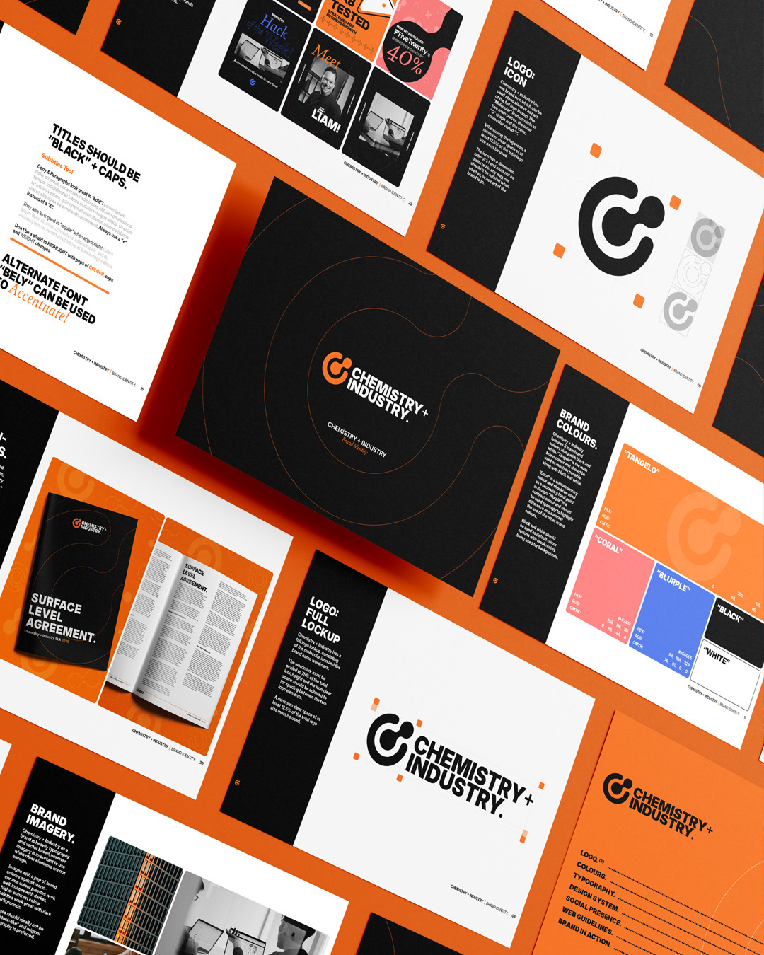
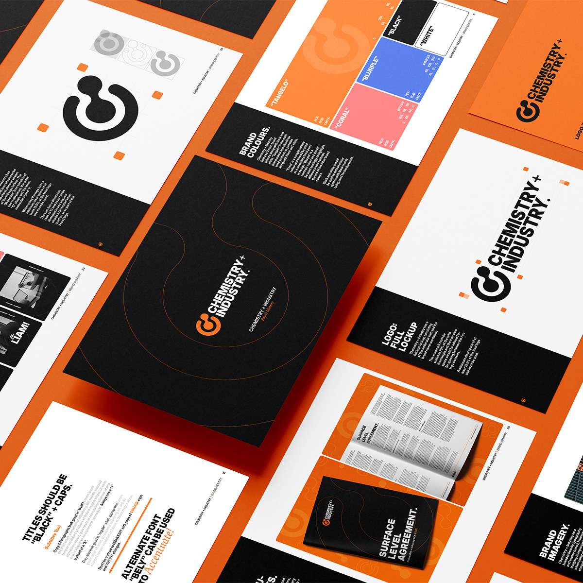
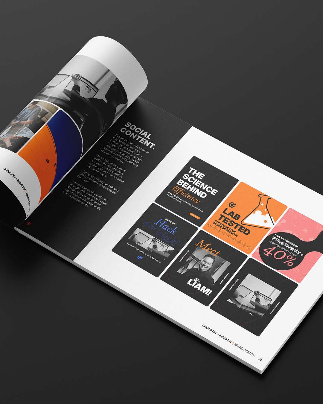
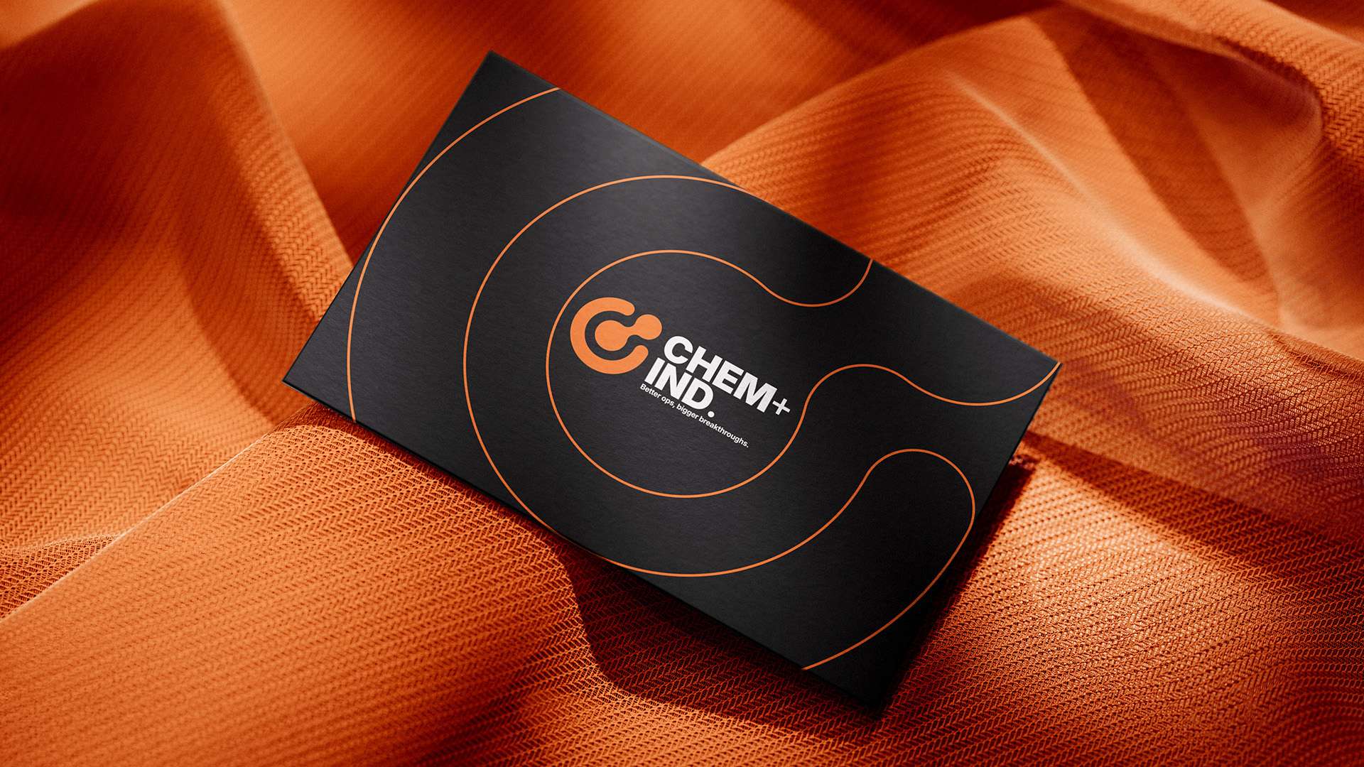
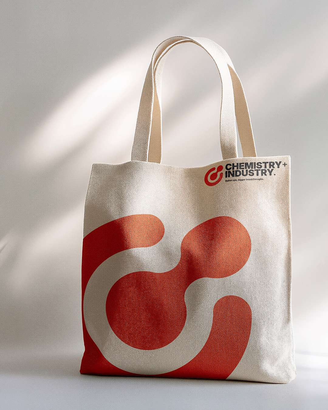
Chemistry + Industry needed a contemporary identity for its approach to operations management. The challenge was to make a complex service feel approachable and credible without relying on familiar corporate styling. The brand needed to speak to growing businesses while expressing the thinking behind its offer.
A bonded visual language.
I developed the identity around the idea of “the chemistry behind the industry”, using molecular forms to connect the logo suite, iconography and supporting graphics. Brand guidelines established a consistent direction across social content, printed collateral and the website, giving the business a recognisable visual foundation.
Natural ingredients at the heart of the identity.
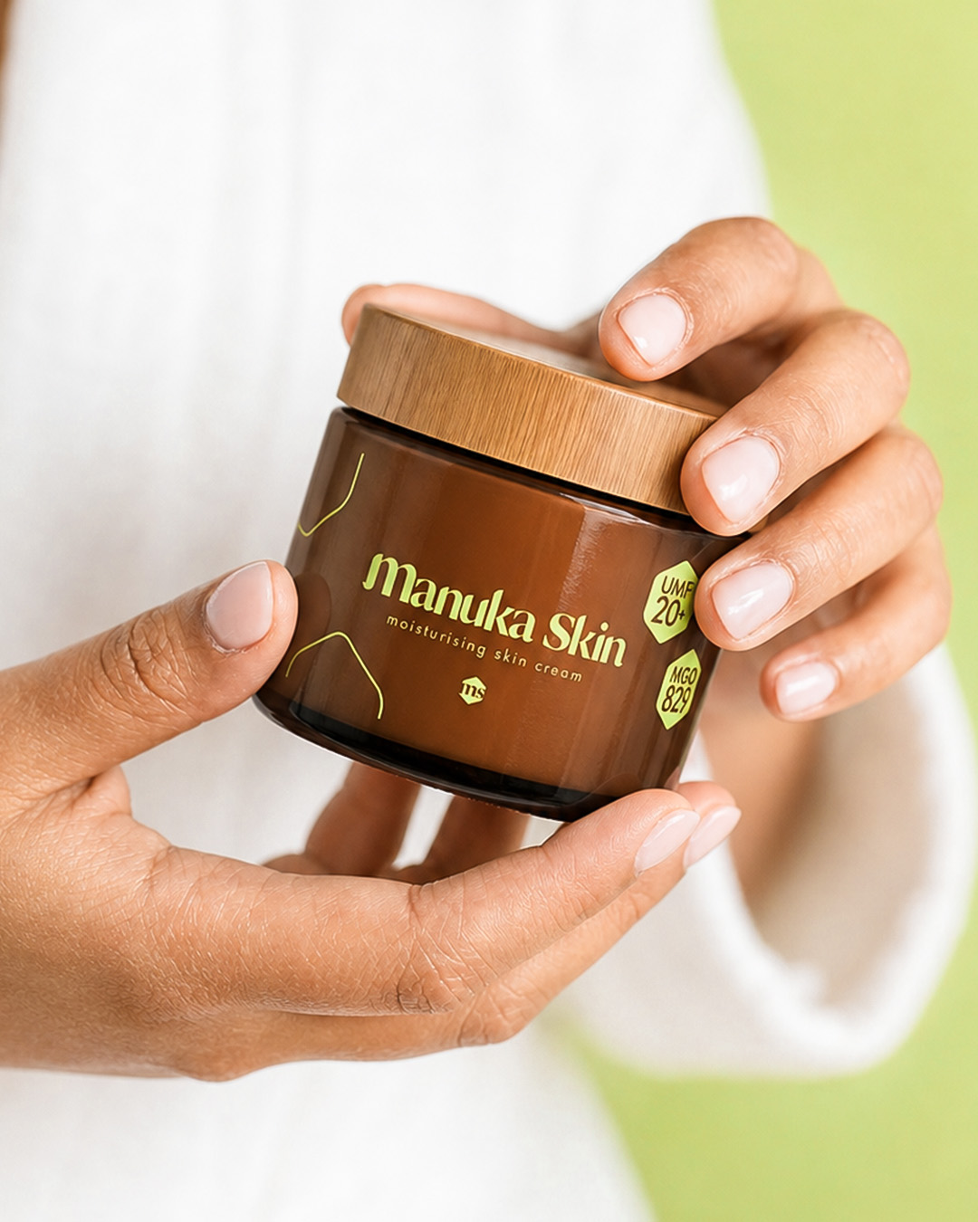
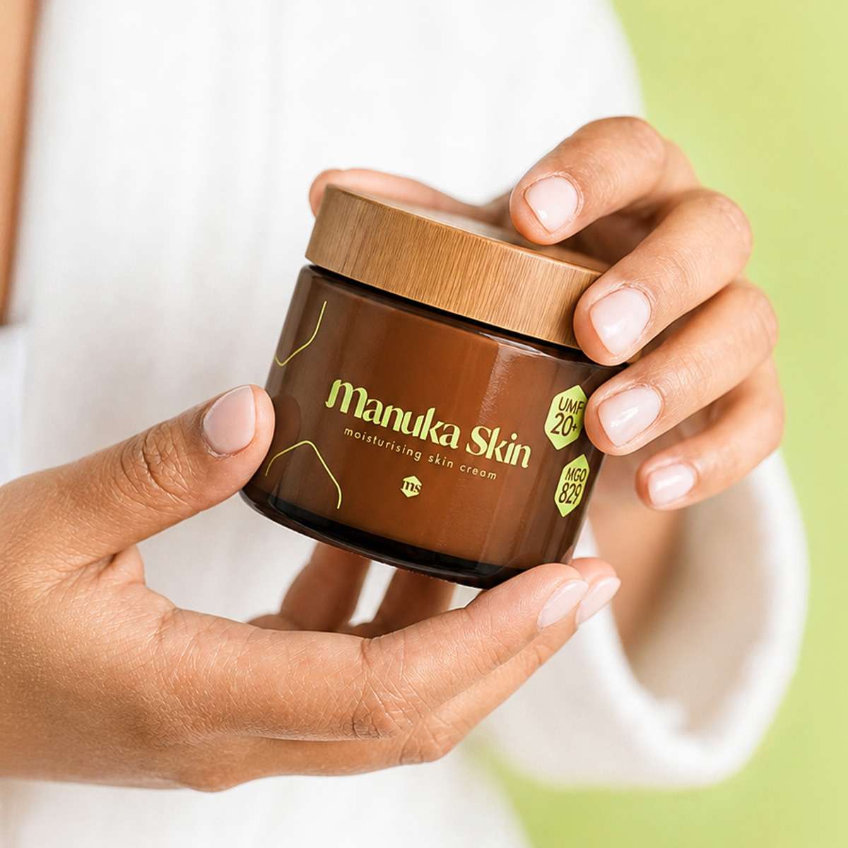
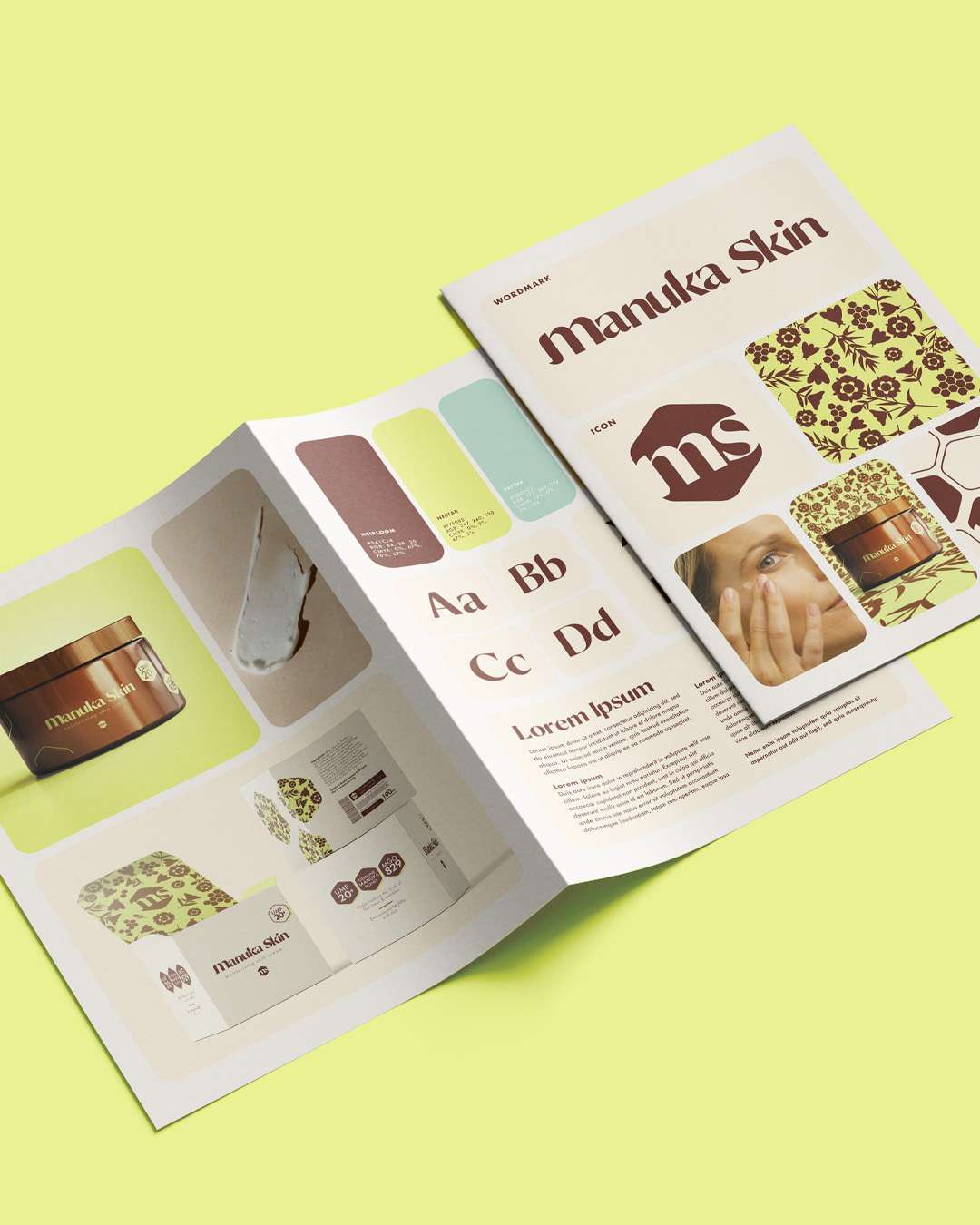
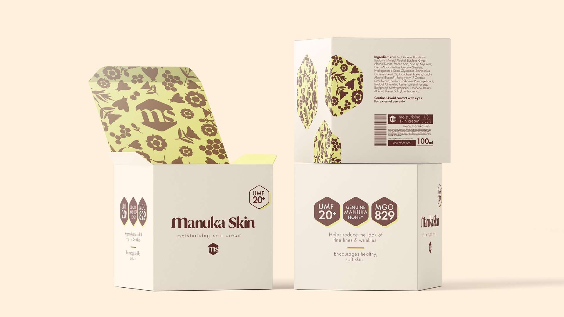
Manuka Skin needed an identity and packaging direction for skincare built around Manuka honey. The brief brought together natural ingredients, sensitive skincare and environmental awareness. The challenge was to communicate those qualities clearly while creating a distinctive presence within a crowded beauty category.
From nature to finished product.
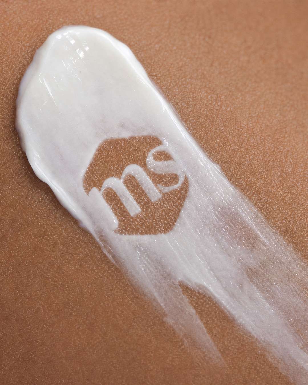
I created the logo, visual direction and packaging system, supported by a pattern inspired by the Manuka flower and honey bee. Applied across the product, retail box and brand materials, the identity combined expressive detail with simple packaging presentation that reflected the brand’s environmental considerations.
Making Gen-Z skincare feel real.
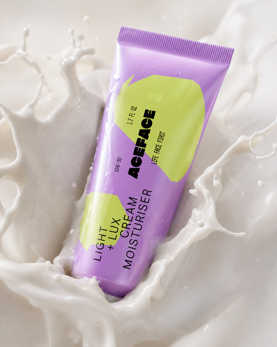
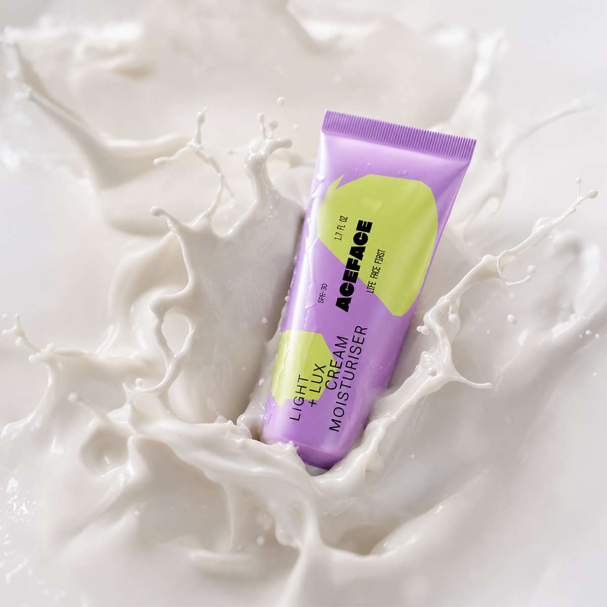
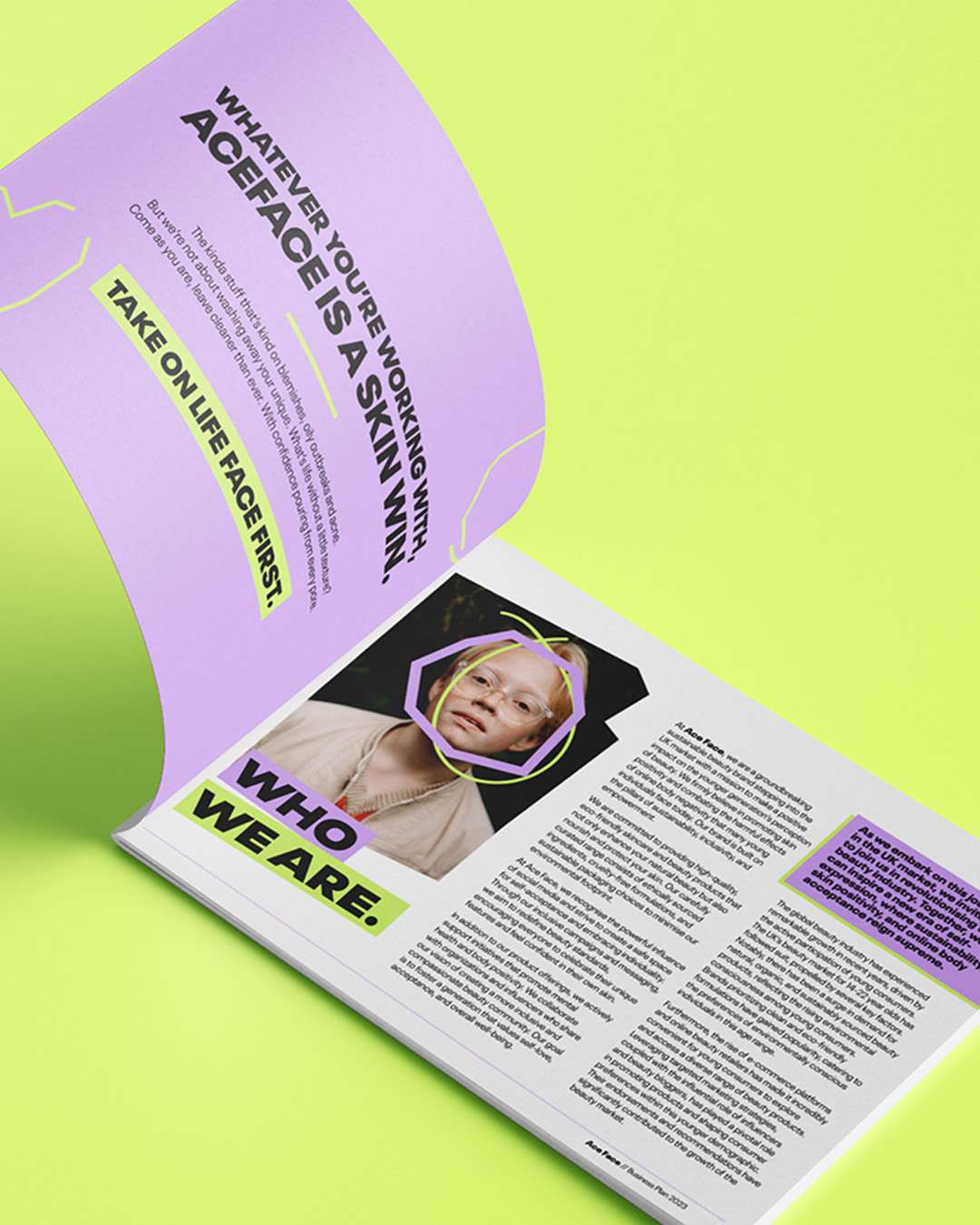
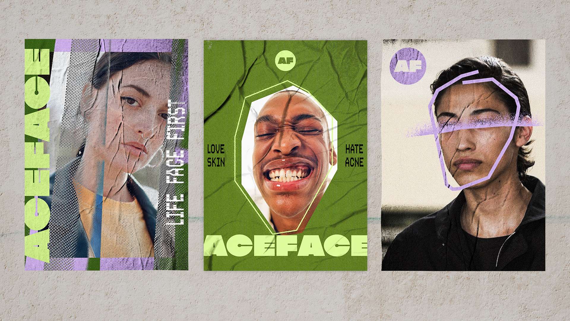
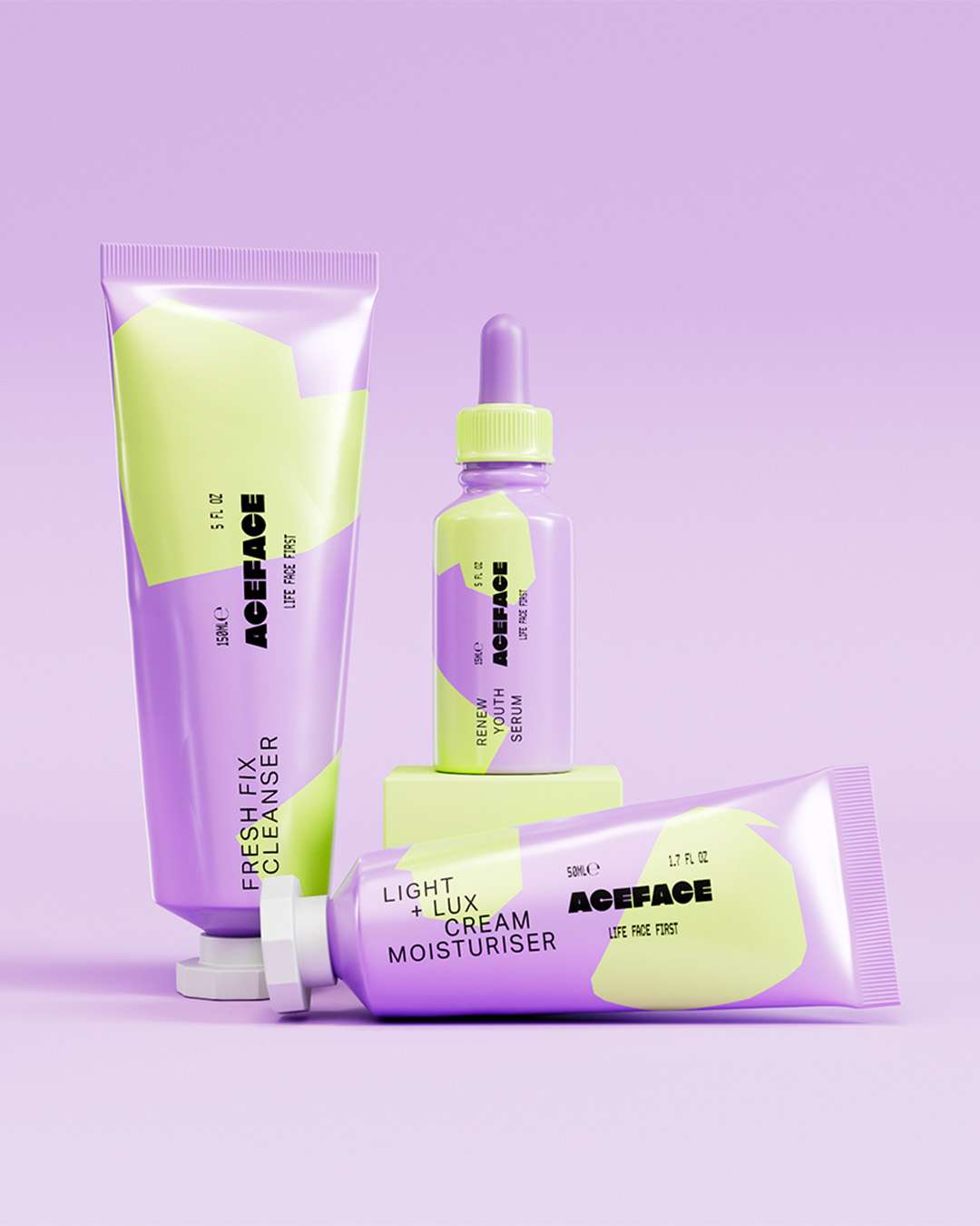
Ace Face needed to turn its existing identity into a convincing vision for a Gen Z skincare range. With limited physical products available, the brand required a prospectus that could communicate its audience, proposed range and creative direction to investors and manufacturing partners before production.
Making the vision clear.
I developed the prospectus using the existing branding, creating product concepts, social assets and 3D packaging mockups. Together, these materials showed how the identity could work across a coherent range, giving stakeholders a clearer understanding of the proposed products and their position within the beauty market.
A creative studio with an extra kick.
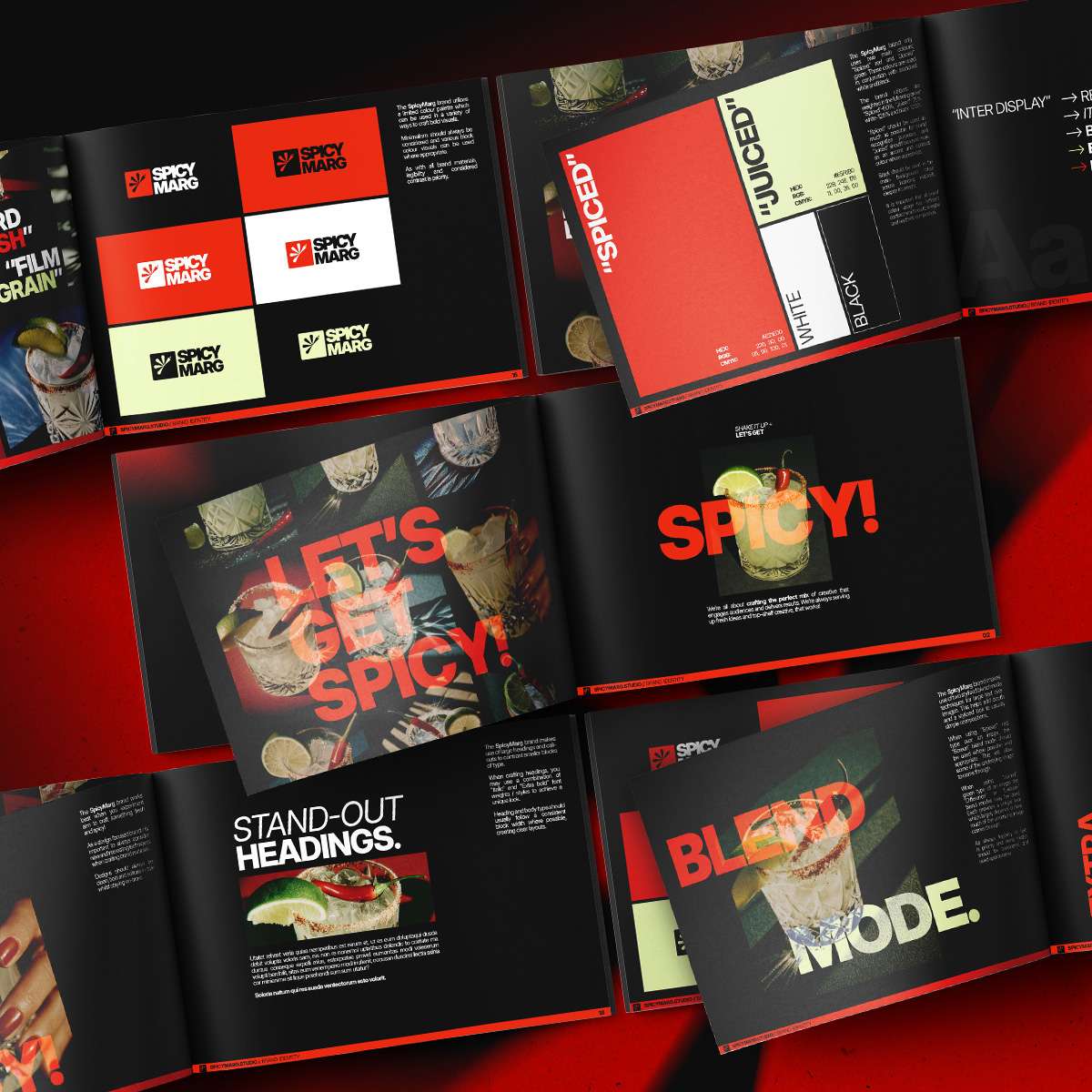
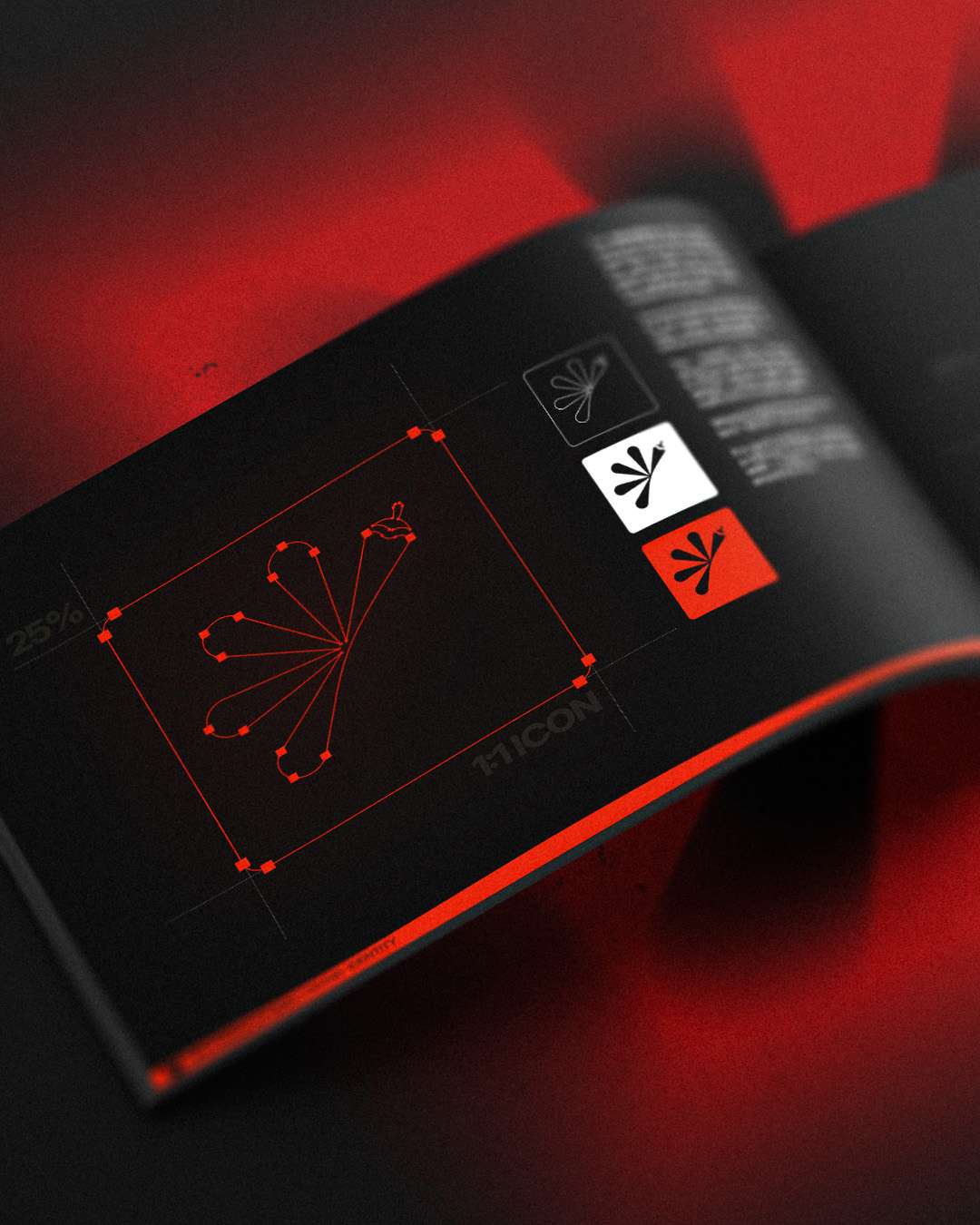
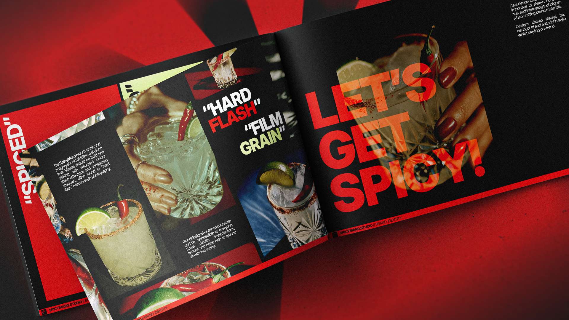
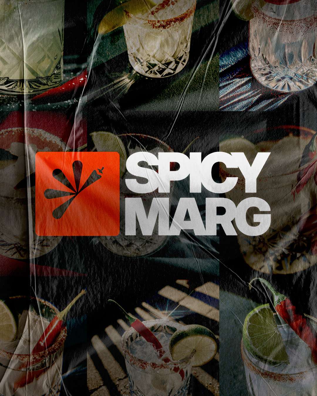
Spicy Marg Studio needed an identity that balanced creative credibility with the playful character behind its name. In a market where agencies often look and sound alike, the brief was to create a confident, distinctive brand that could communicate a broad creative offer without becoming generic.
Where heat meets sweet.
I developed the complete brand direction, including the logo, colour palette, typography, imagery and tone of voice. Brand guidelines brought these elements together, while initial social graphics and website applications explored how the identity could retain its irreverent personality across different channels and formats.
High-protein flavour meets bold branding.
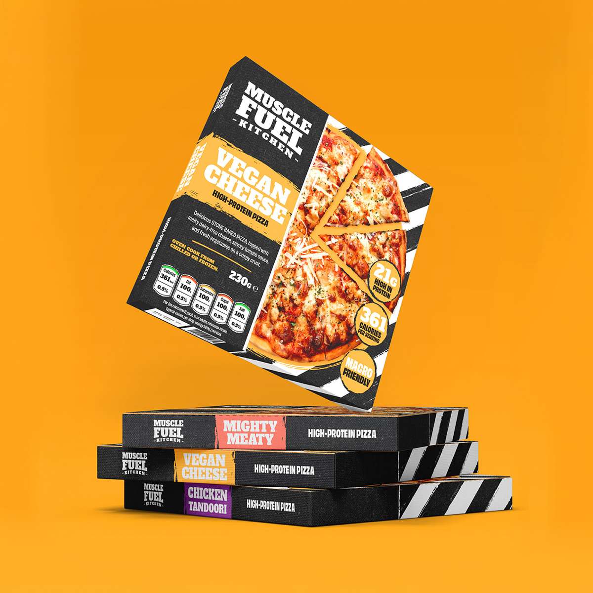
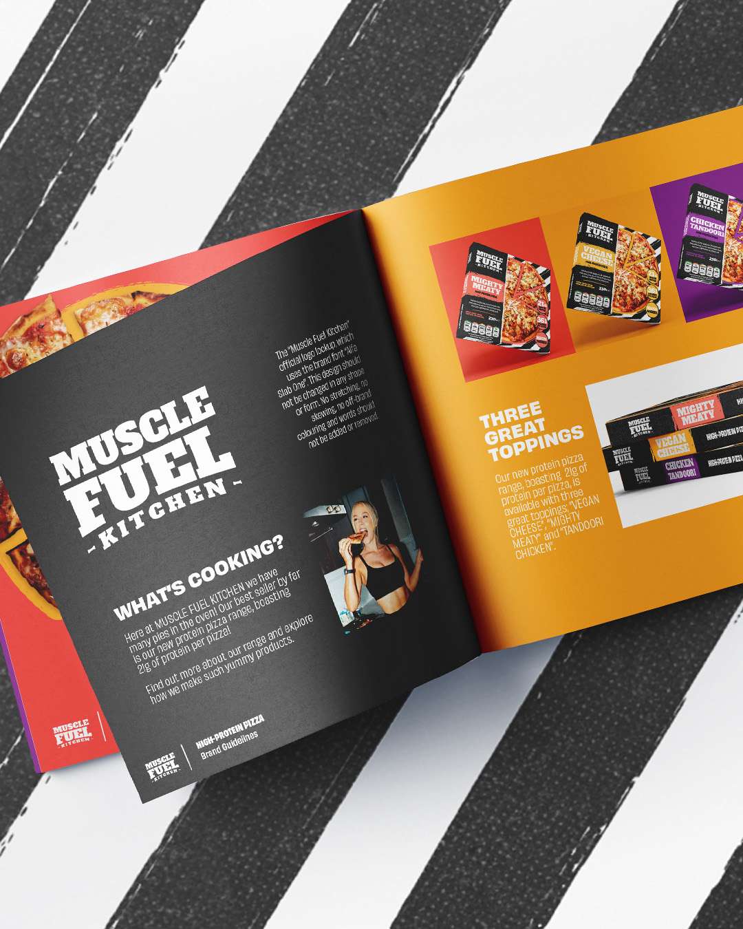
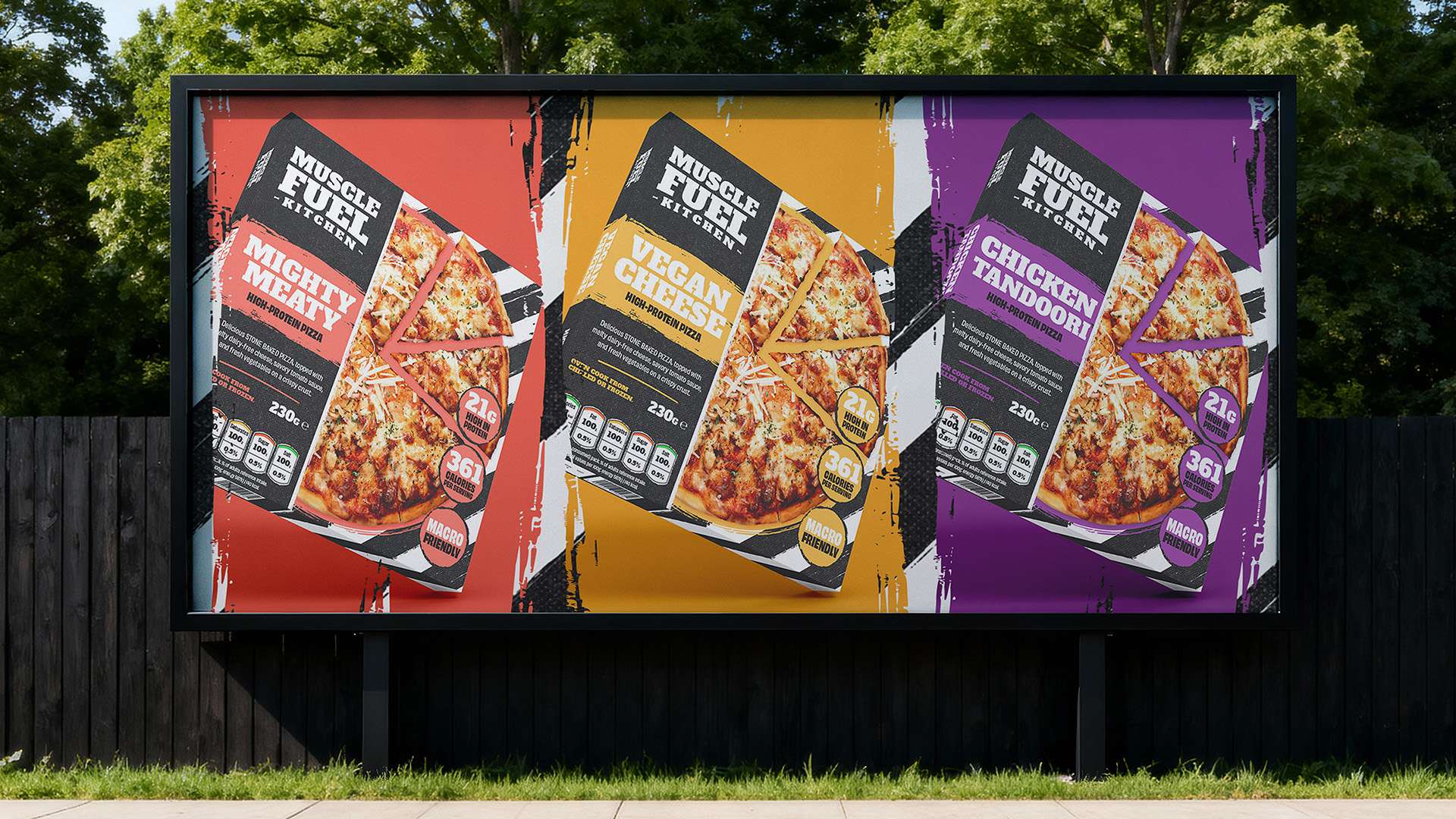
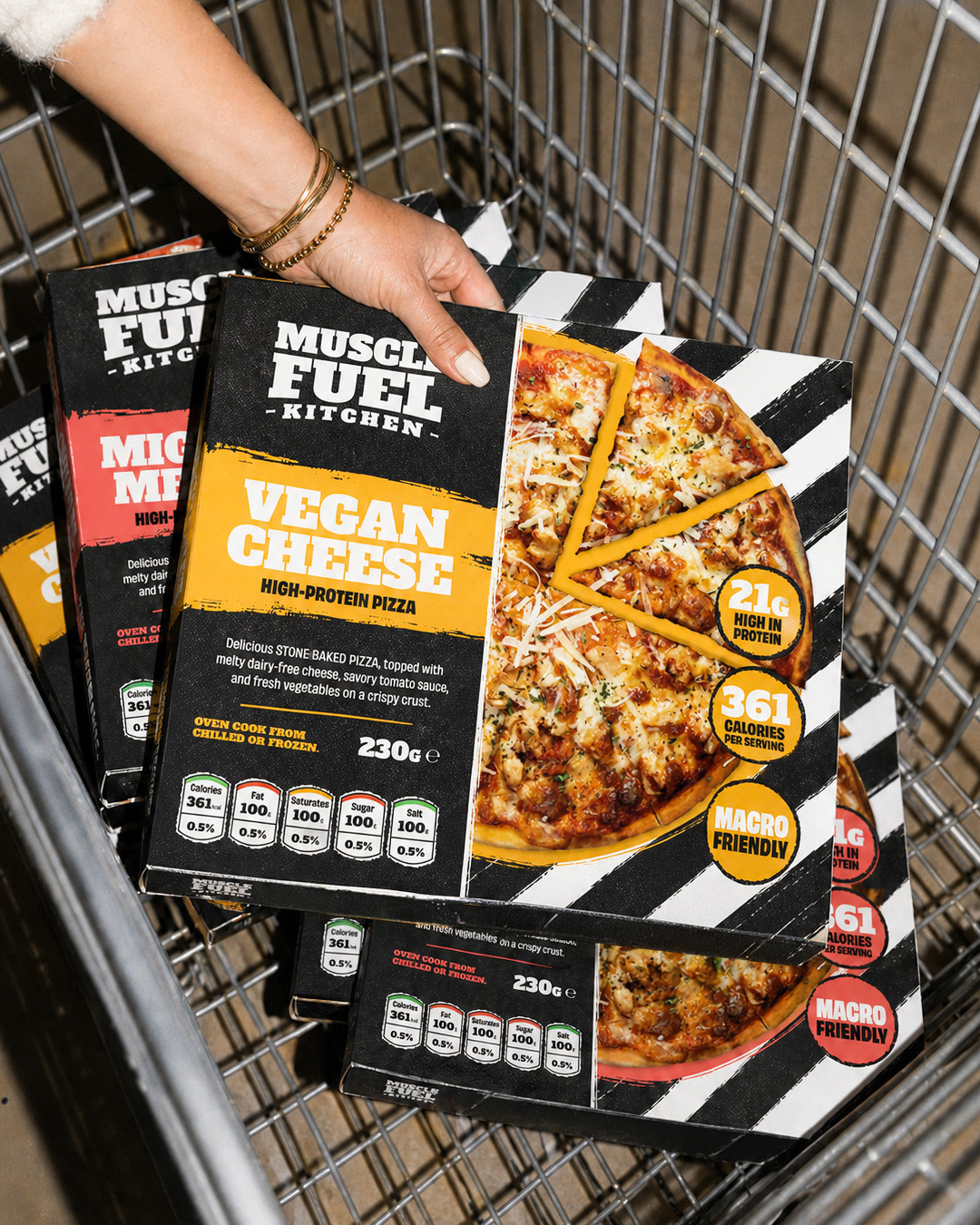
Muscle Fuel Kitchen needed an identity and packaging system for its flagship range of high-protein pizzas. The designs had to communicate nutritional benefits without losing the appeal of the food itself. The challenge was to feel relevant to gym lovers without resembling conventional sports supplements or restrictive health-food packaging.
One identity, distinct flavours.
I created the logo and wider visual direction before applying the identity across the pizza range. Topping-specific colourways and product graphics gave each variant its own character while keeping the family recognisable. The final brand and packaging visuals brought the nutritional message and food presentation together for handover.
Creative support for a bubbling brand.
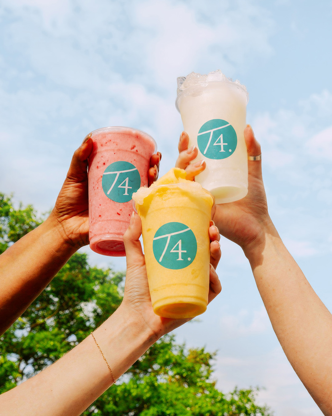
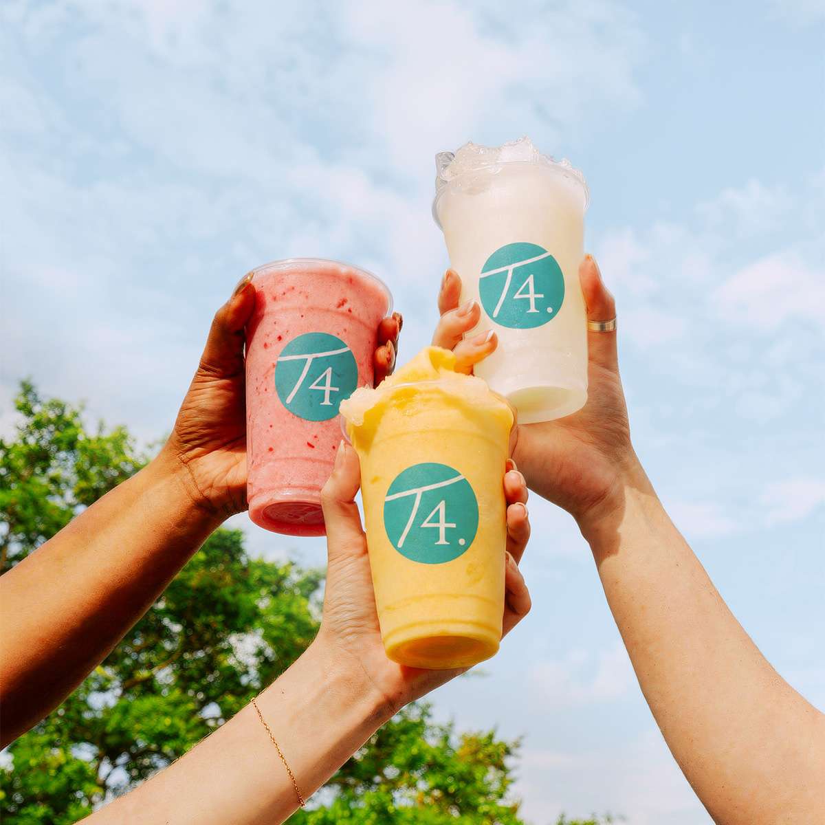
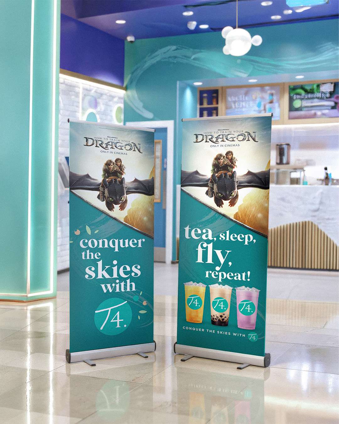
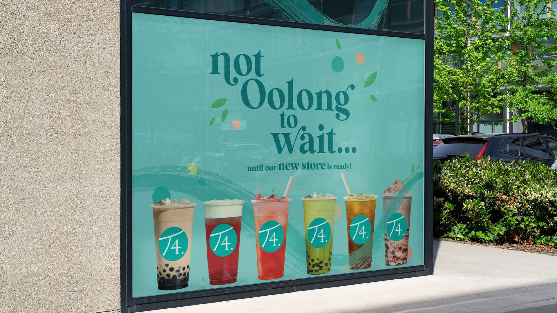
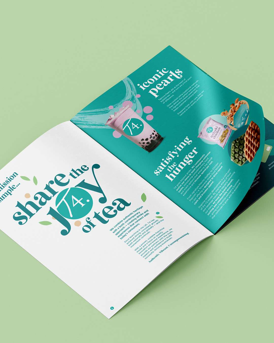
T4 Bubble Tea needed ongoing creative support for national campaigns and the everyday demands of its UK franchise network. Working directly with the UK marketing director, I helped adapt the global identity for local audiences, balancing planned launches, franchise requests and collaborations across a wide range of formats.
Consistency around the world.
I created campaign key visuals, digital menus, posters, social content, event materials and internal communications. The work also included collaboration assets involving Universal Studios, Disney and PepsiCo for UK and international use, maintaining a recognisable brand presence while responding to different audiences, locations and campaign requirements.
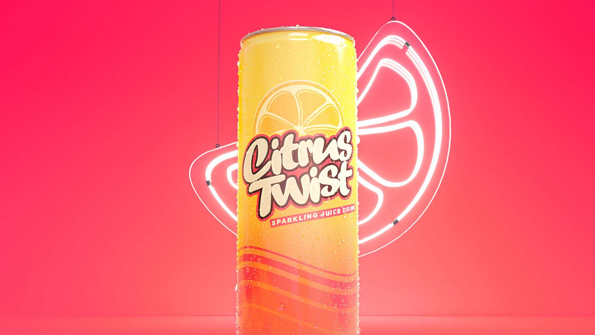
A fresh twist for sparkling drinks.
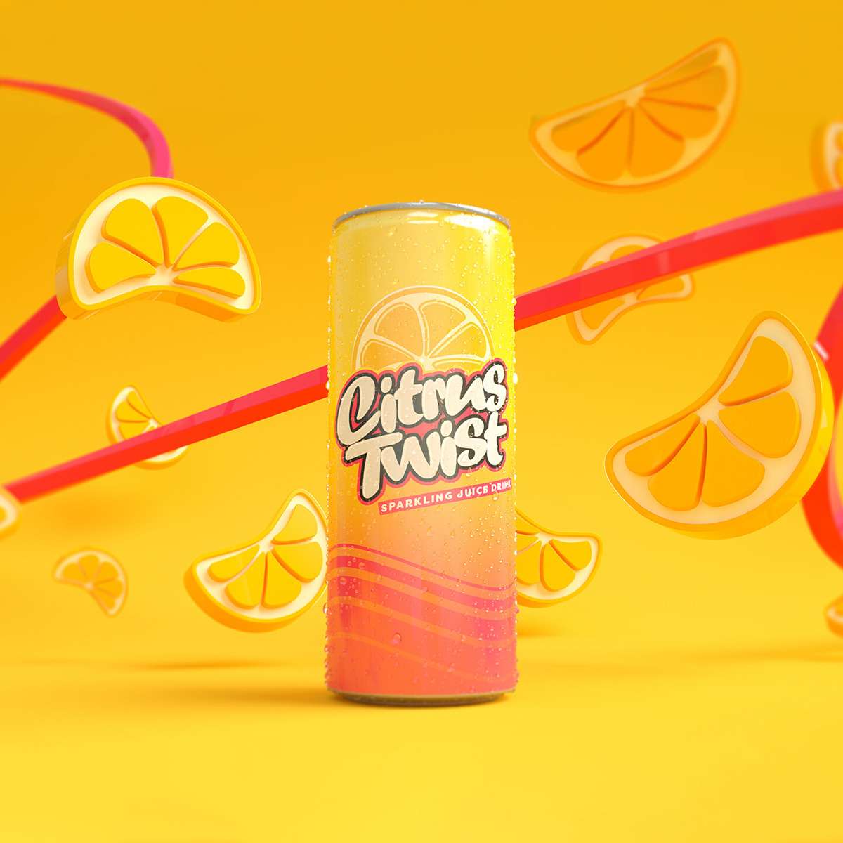
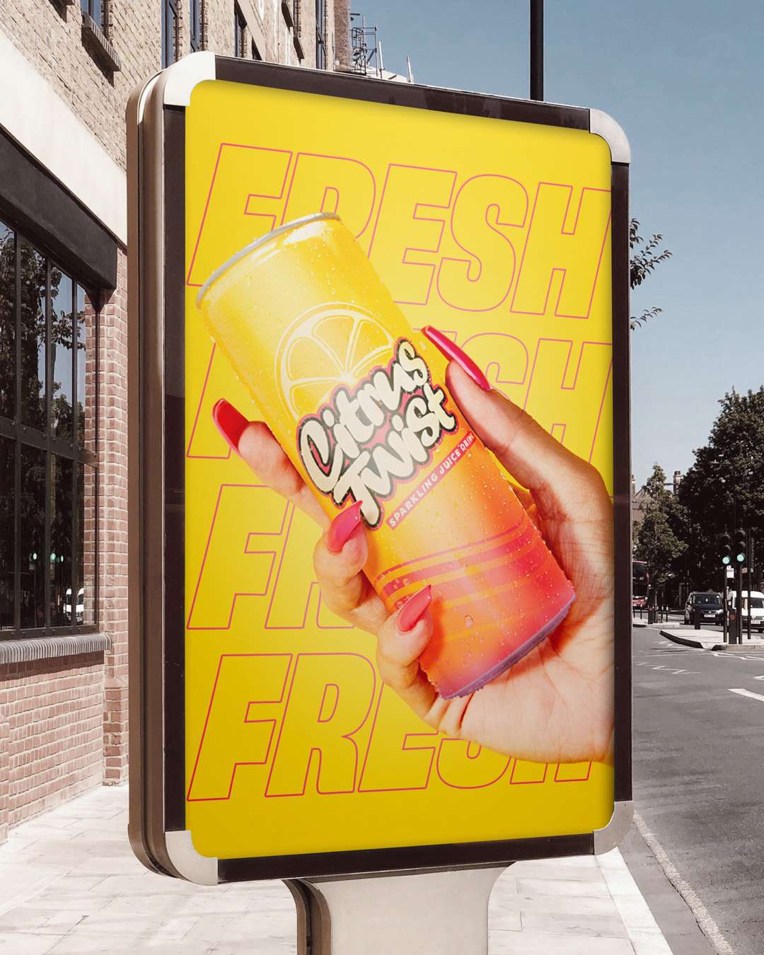
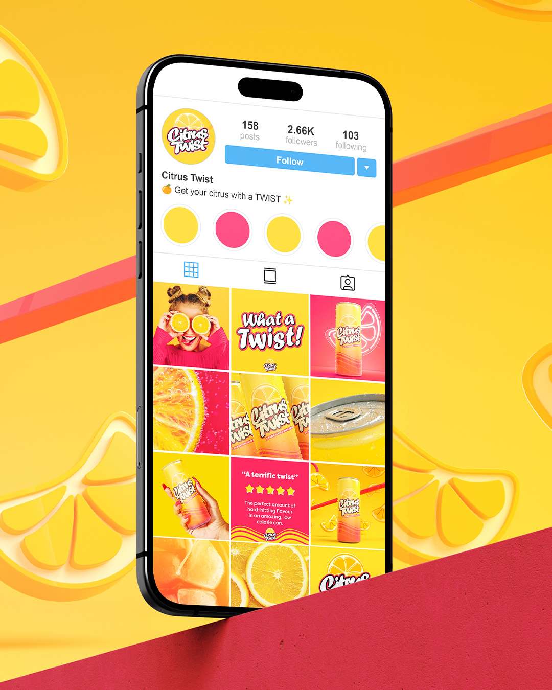
Citrus Twist was an exploration of how a canned sparkling juice could express freshness and flavour through a bold identity. The concept needed to feel colourful and energetic while remaining recognisable in a crowded drinks category, with a visual direction that could work beyond the can.
Concepts beyond the can.
I developed the identity and packaging design, then explored their wider application through 3D product renders, campaign graphics and social assets. These applications tested how the concept could hold together across different formats, connecting the product presentation with a broader, expressive brand world.
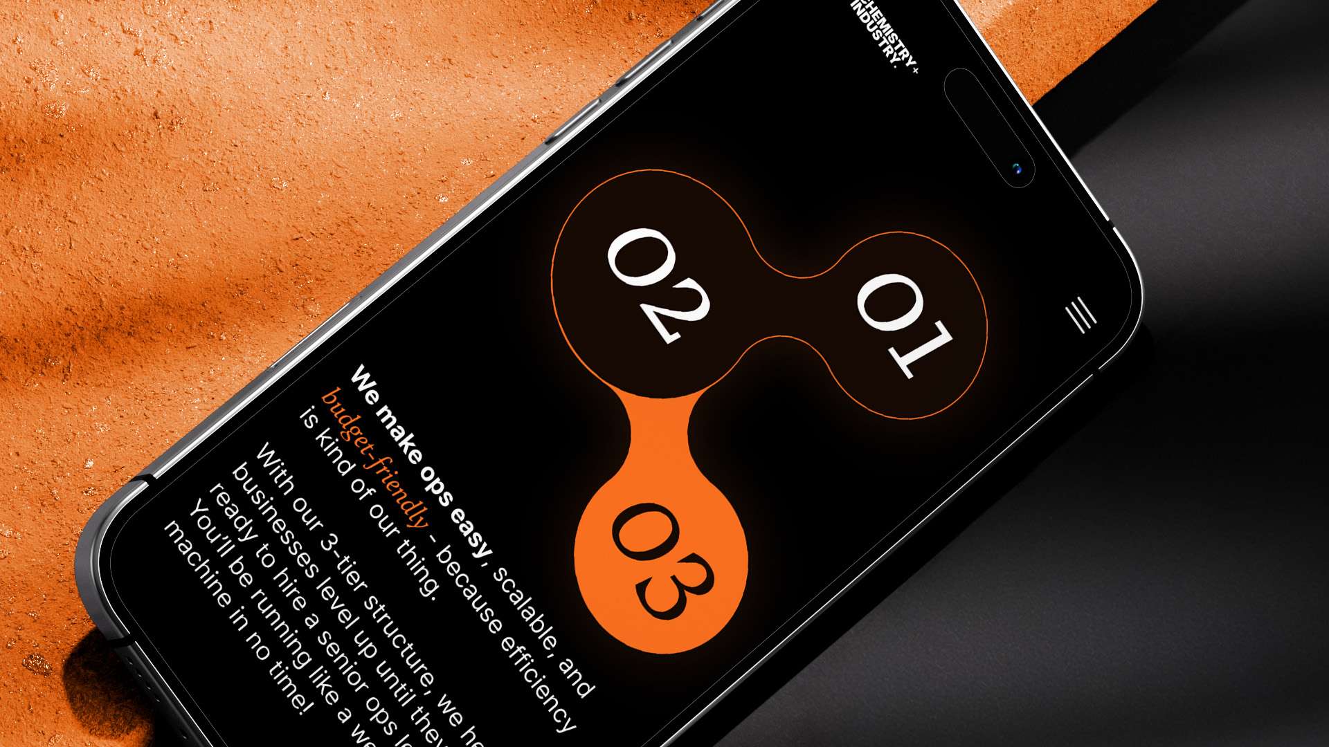
Making ops management easier to understand.
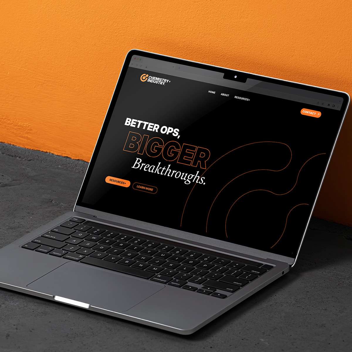
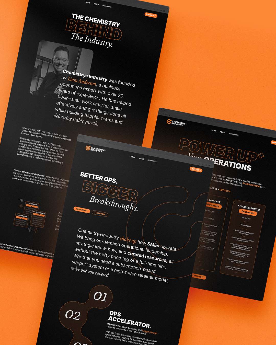
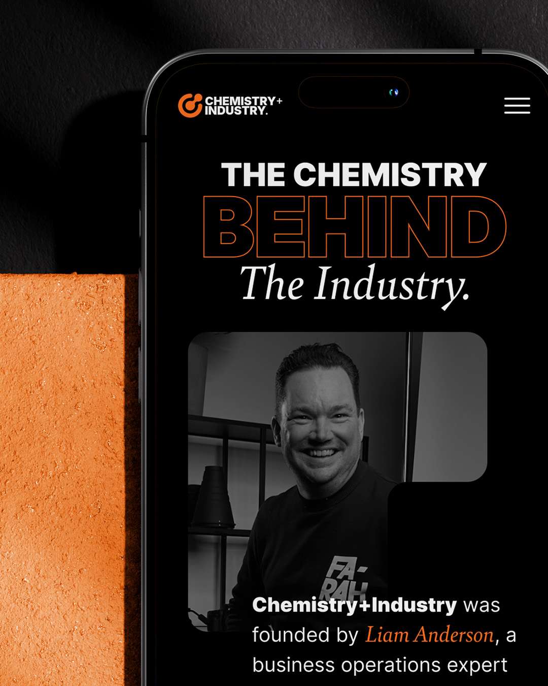
Chemistry + Industry needed a website that translated its operations consultancy offer into a clear digital experience. Building on the brand identity, the design had to communicate the agency’s approach and service packages while retaining the contemporary, credible character established across its wider visual presence.
Connecting brand and message.
I designed the webpages and complete website prototype, extending the molecular-inspired identity into a consistent digital system. The work brought the brand’s visual direction together with its service information, creating a connected presentation of the business and preparing the designs for developer handover.
Giving angels a distinctive platform.
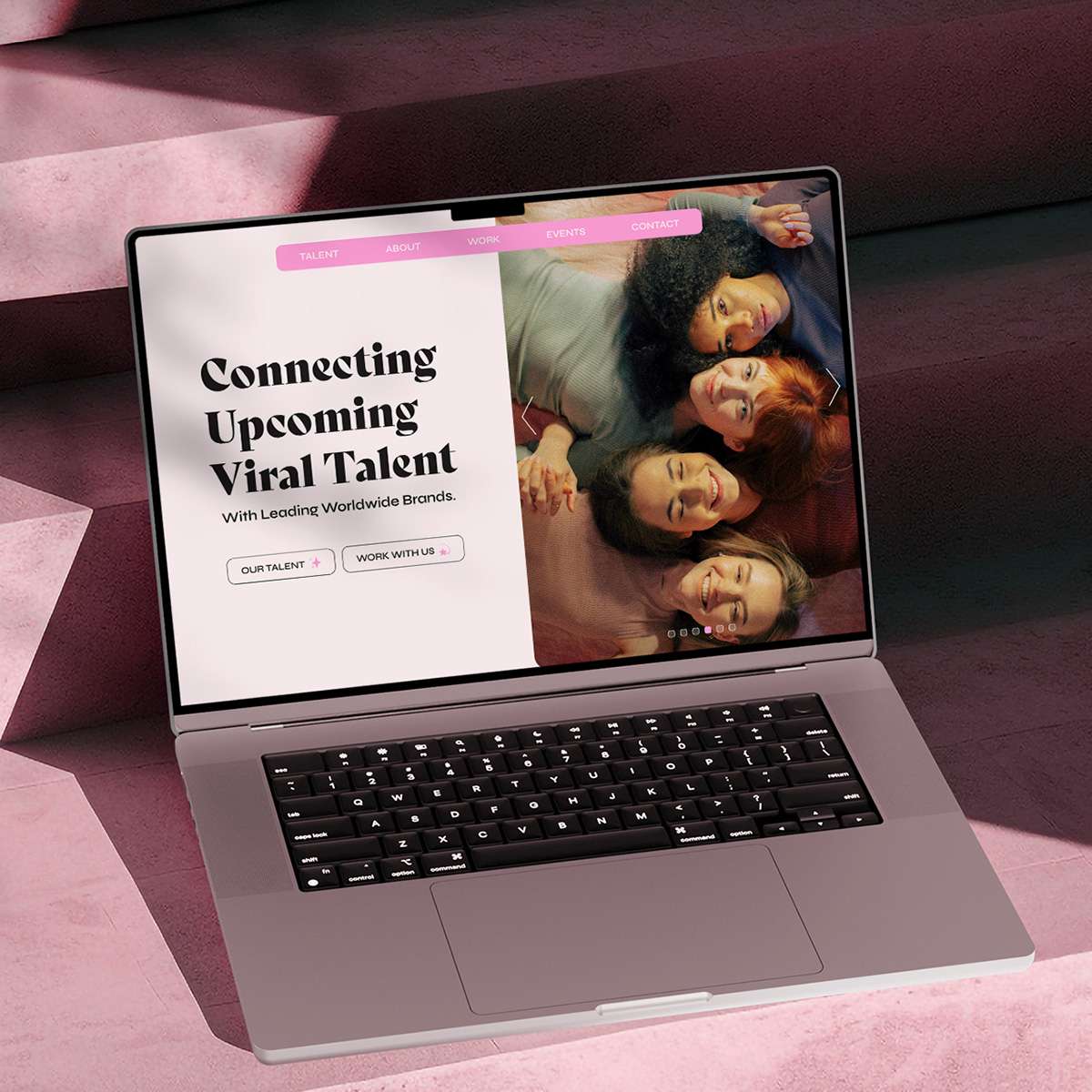
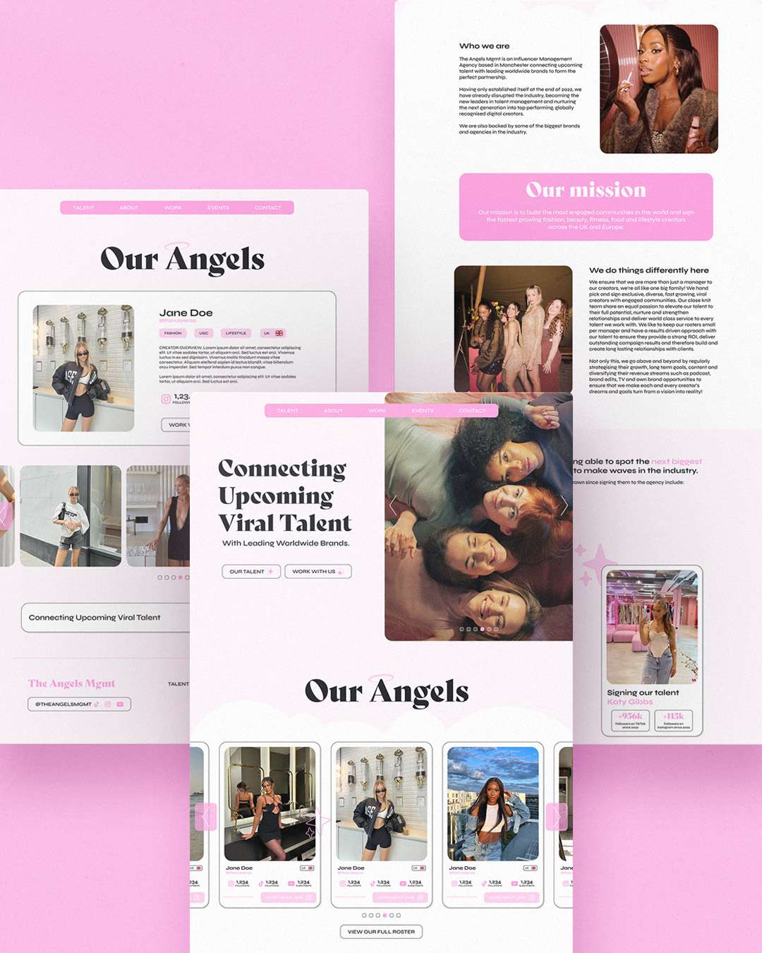
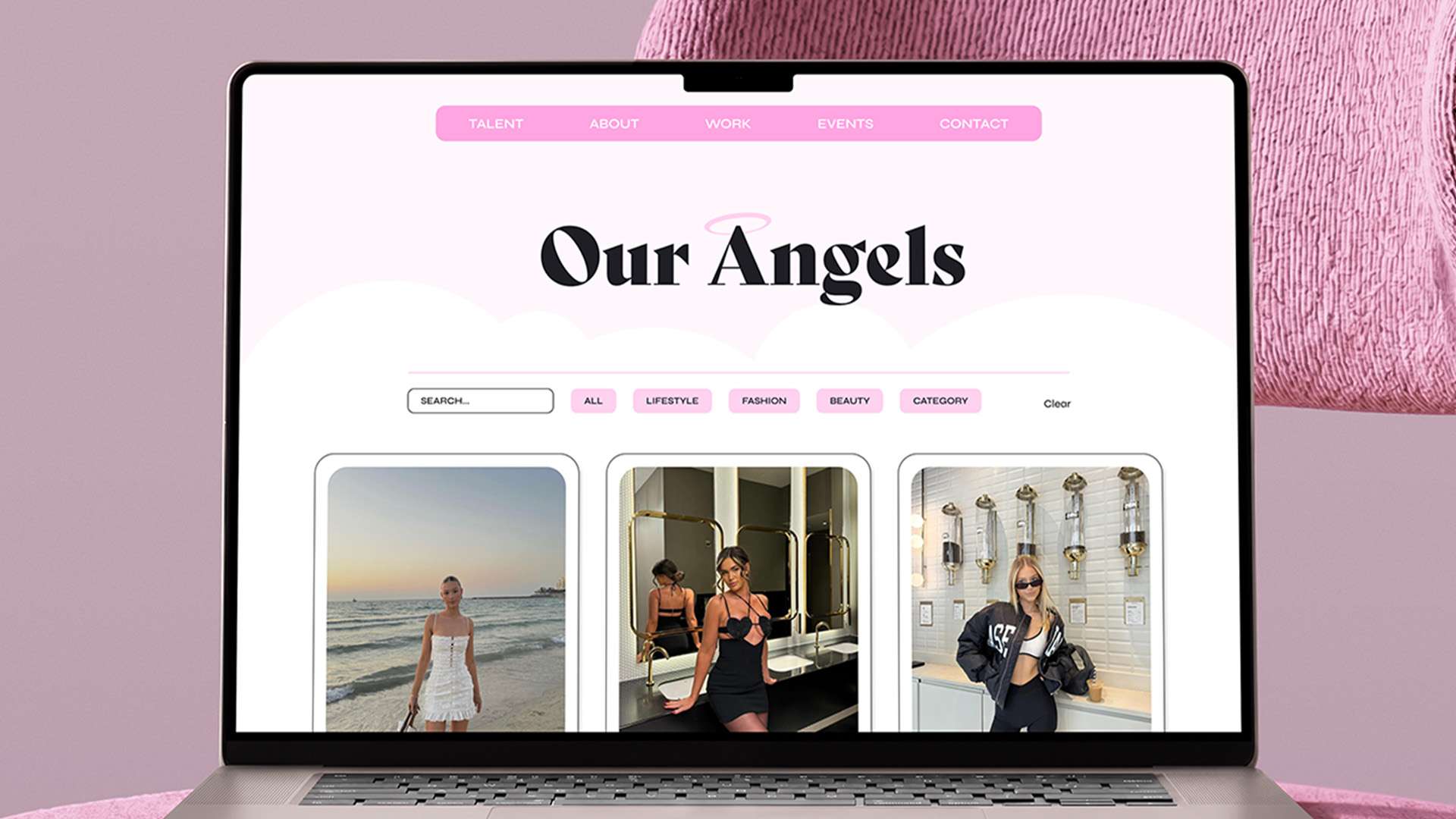
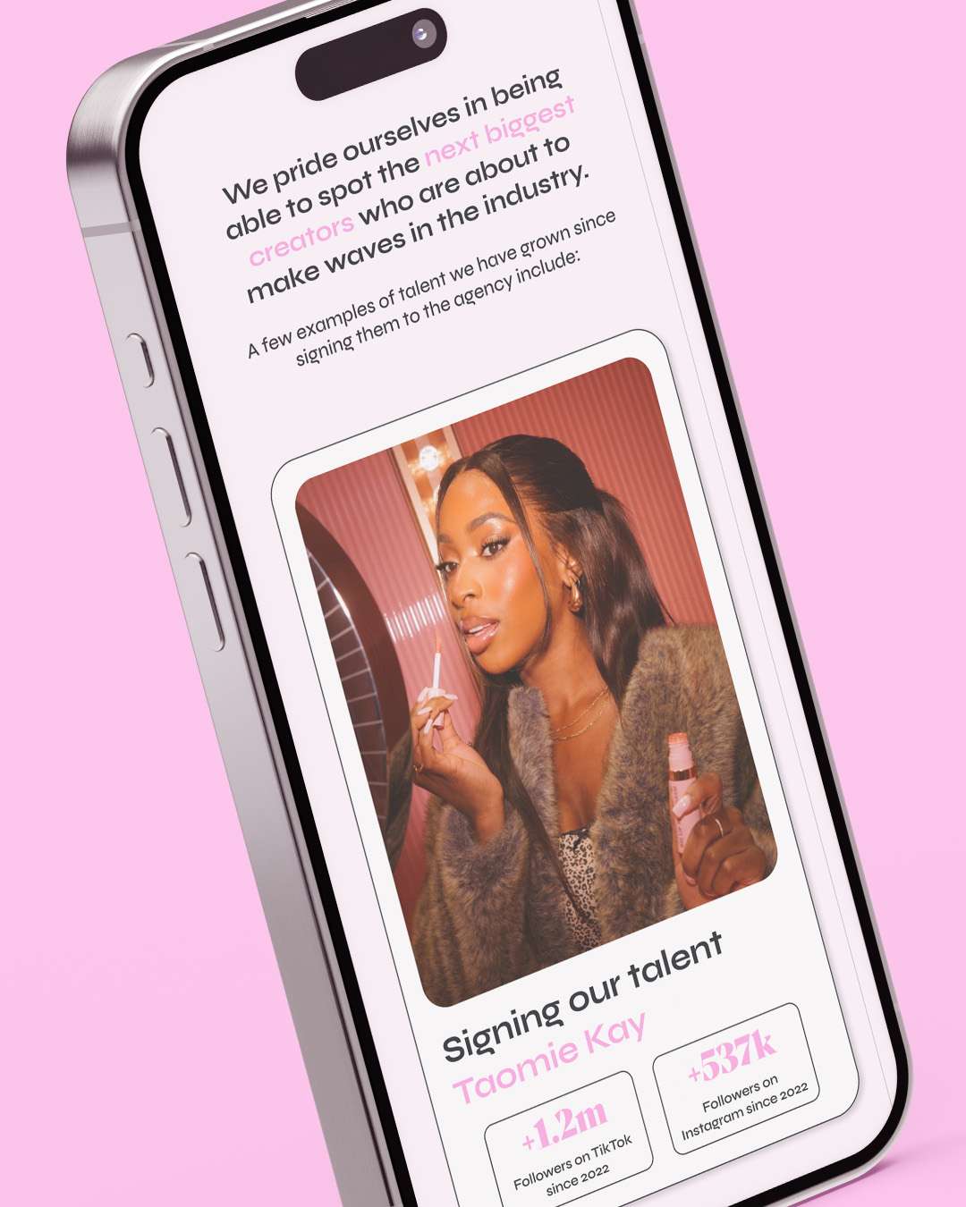
Angels MGMT needed a website that gave its talent a distinctive presence and helped introduce them to prospective brand partners. The design combines prominent photography with expressive typography and a soft pink palette, putting the people at the centre while giving the agency a recognisable personality of its own.
Creative from the clouds.
I developed a playful digital direction supported by angel-inspired details and a retro-tech feel. The website used Shopify’s content collections to organise the talent roster, allowing clients to see exactly who they’re working with and how they’d be a good fit, all without the clutter.
Shaking up a personality online.
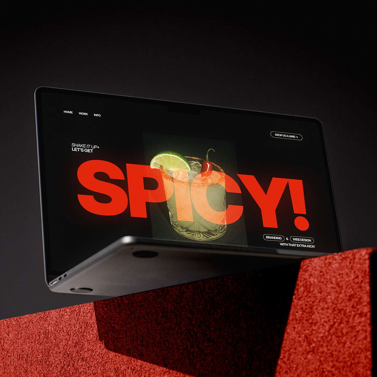
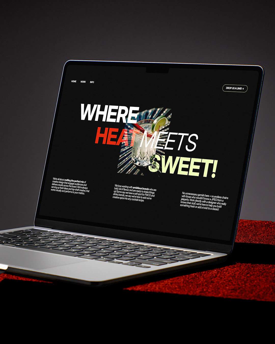
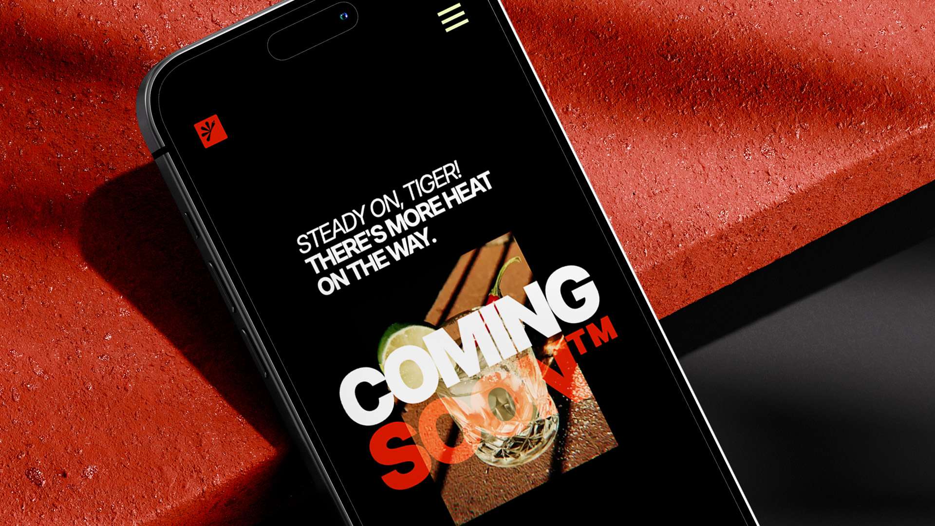
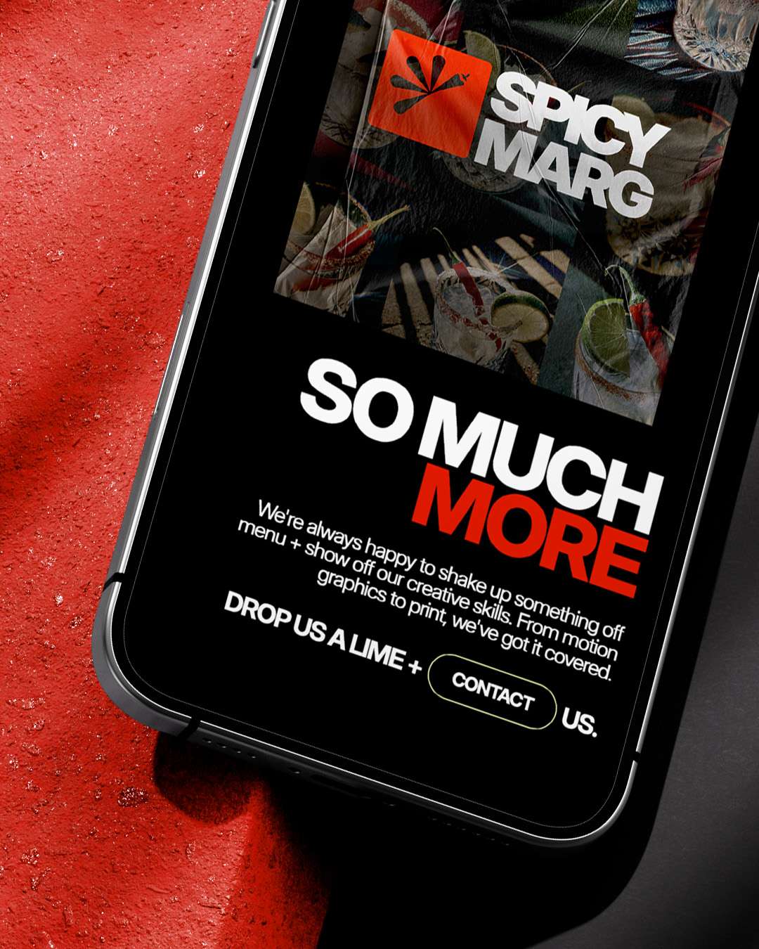
Spicy Marg Studio needed a digital presence that carried the confidence and humour of its identity into a clear presentation of its work. The website had to introduce a broad creative offer while giving individual projects enough space to communicate the thinking and visual direction behind them.
The work takes centre stage.
I designed the website as an extension of the brand system, bringing together its typography, colour, imagery and tone of voice. Project imagery and concise supporting copy introduced the work, while the studio’s playful language connected the portfolio with the wider identity and its invitation to get in touch.
Trade journaling made smarter with AI.
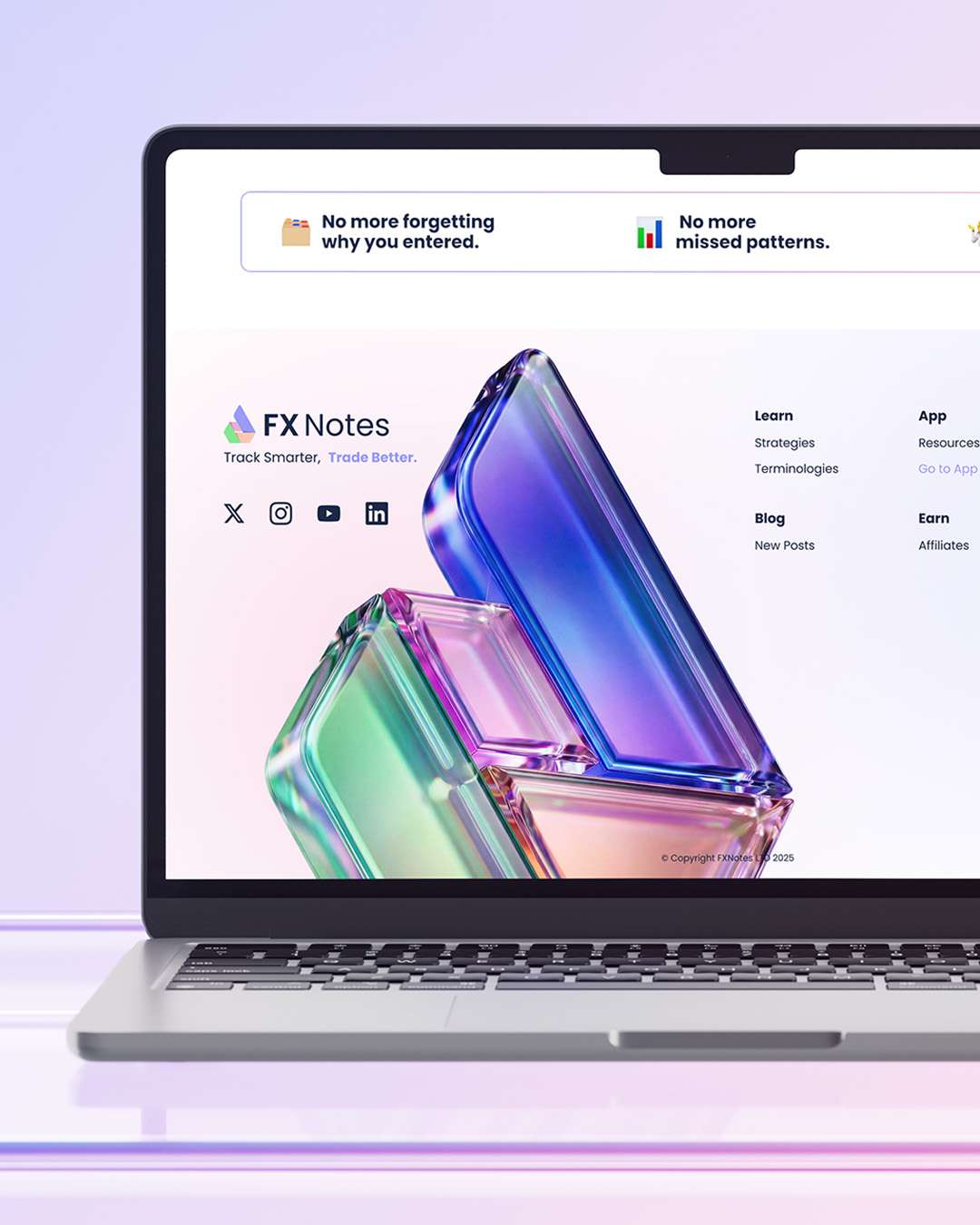
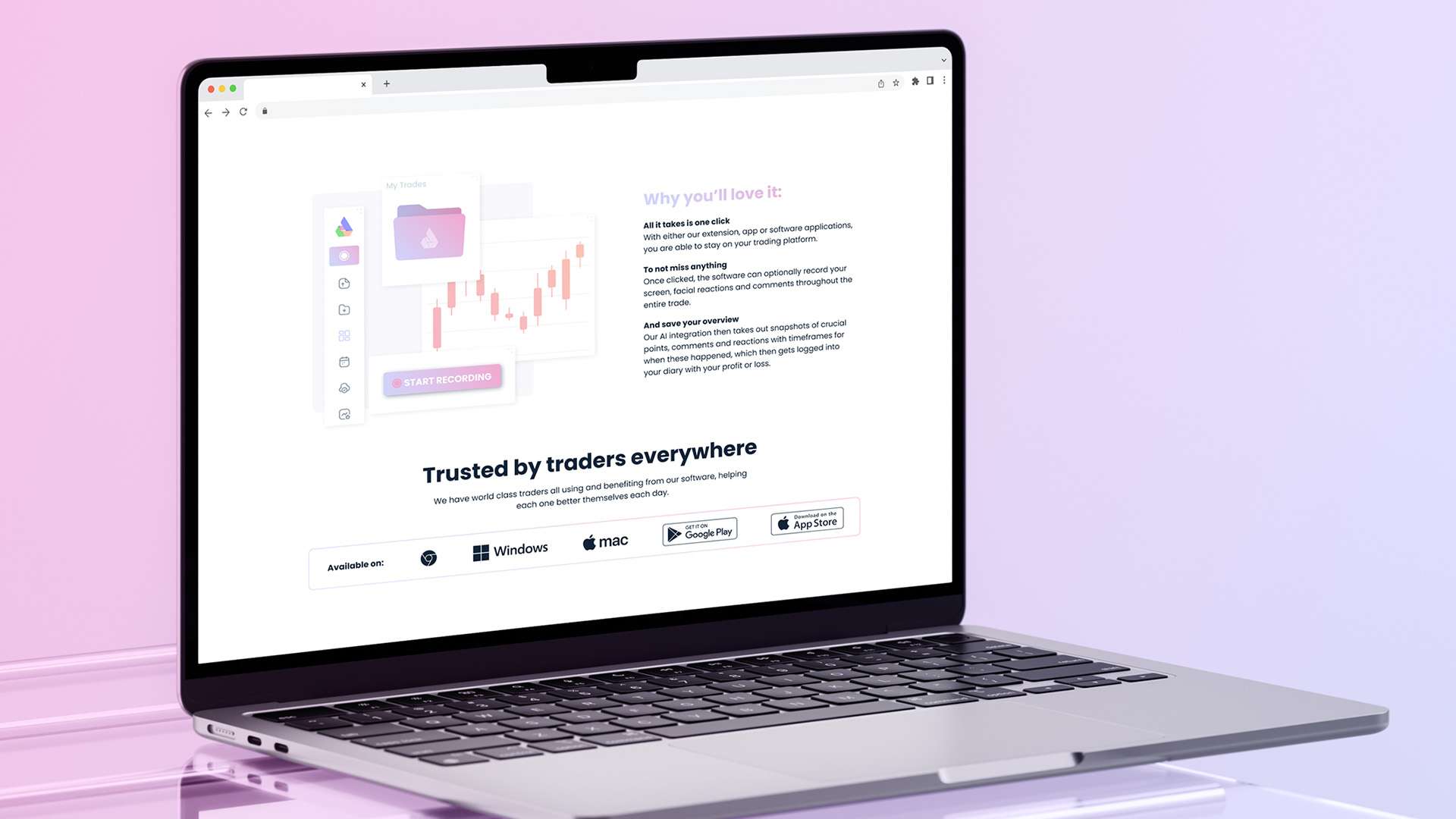
FX Notes needed a website to introduce its AI-assisted trading journal and encourage people to get started. The design pairs a direct product message with a light, spacious presentation, using soft colour and restrained interface details to make the software feel approachable rather than visually overwhelming.

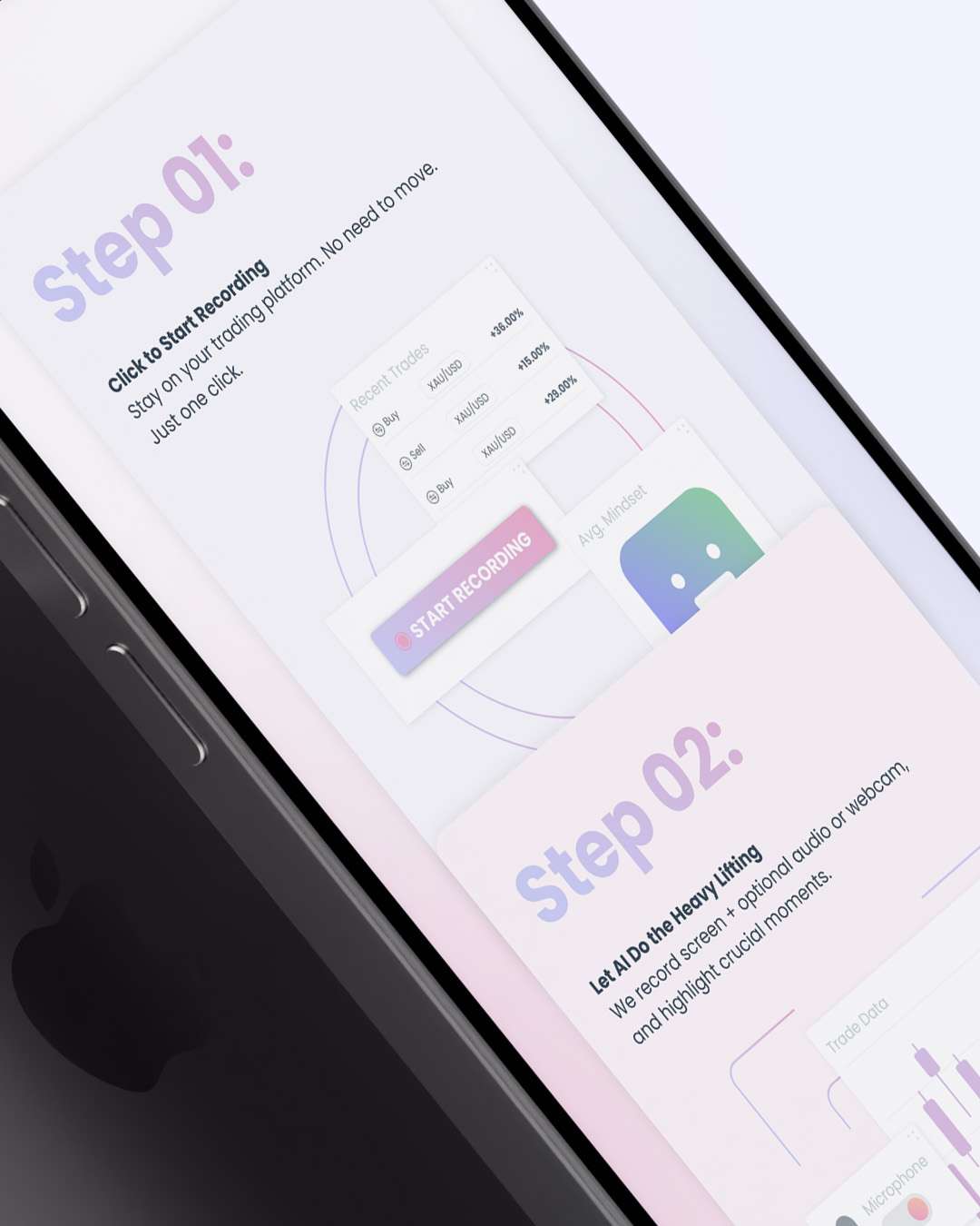
Making AI feel more familiar.
I designed the website and supporting UI kit around pastel gradients, clean typography and a familiar design language associated with leading companies within the AI space. The experience introduces users to the software before they enter the platform, using recognisable interface patterns and clear calls to action to build confidence and guide visitors towards signing up.
Putting UGC creators at the centre of the story.
The UGC Agency needed a website that introduced its creators and explained the value of user-generated content to brands. The creators and their content needed to be front and center, in order to really show off the creativity of user generated content.
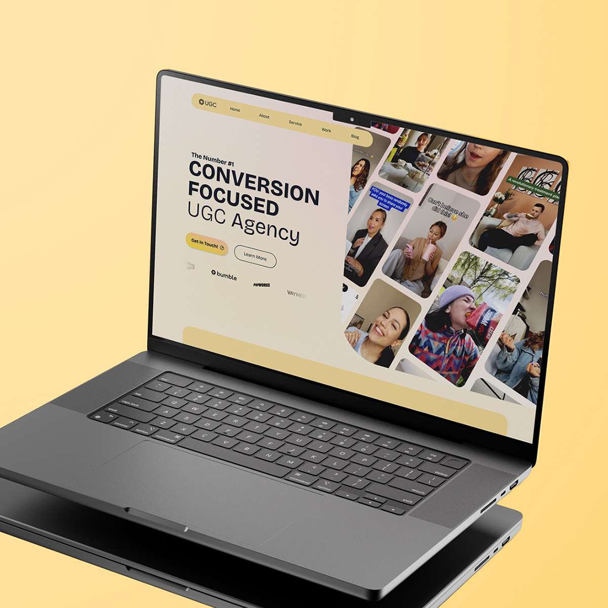
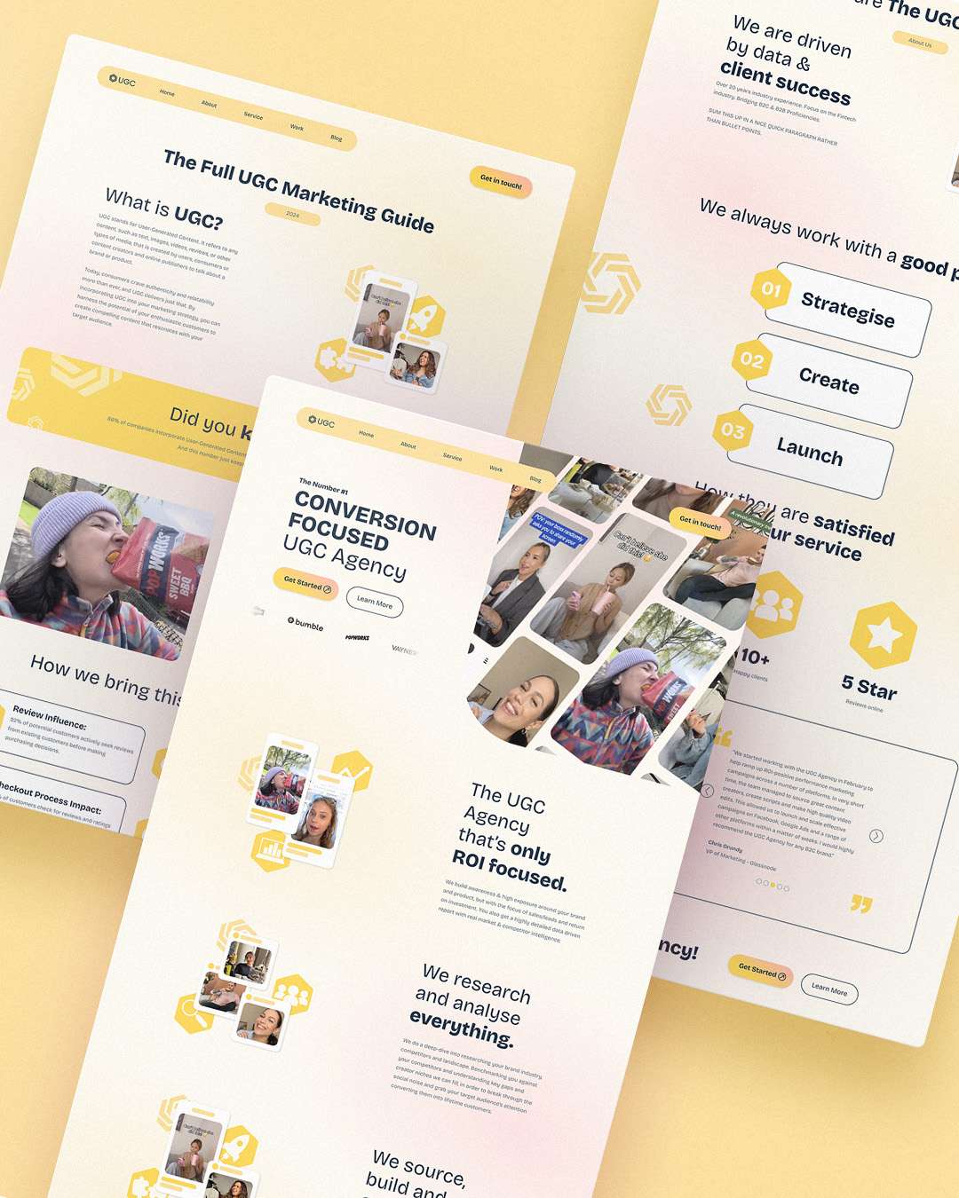
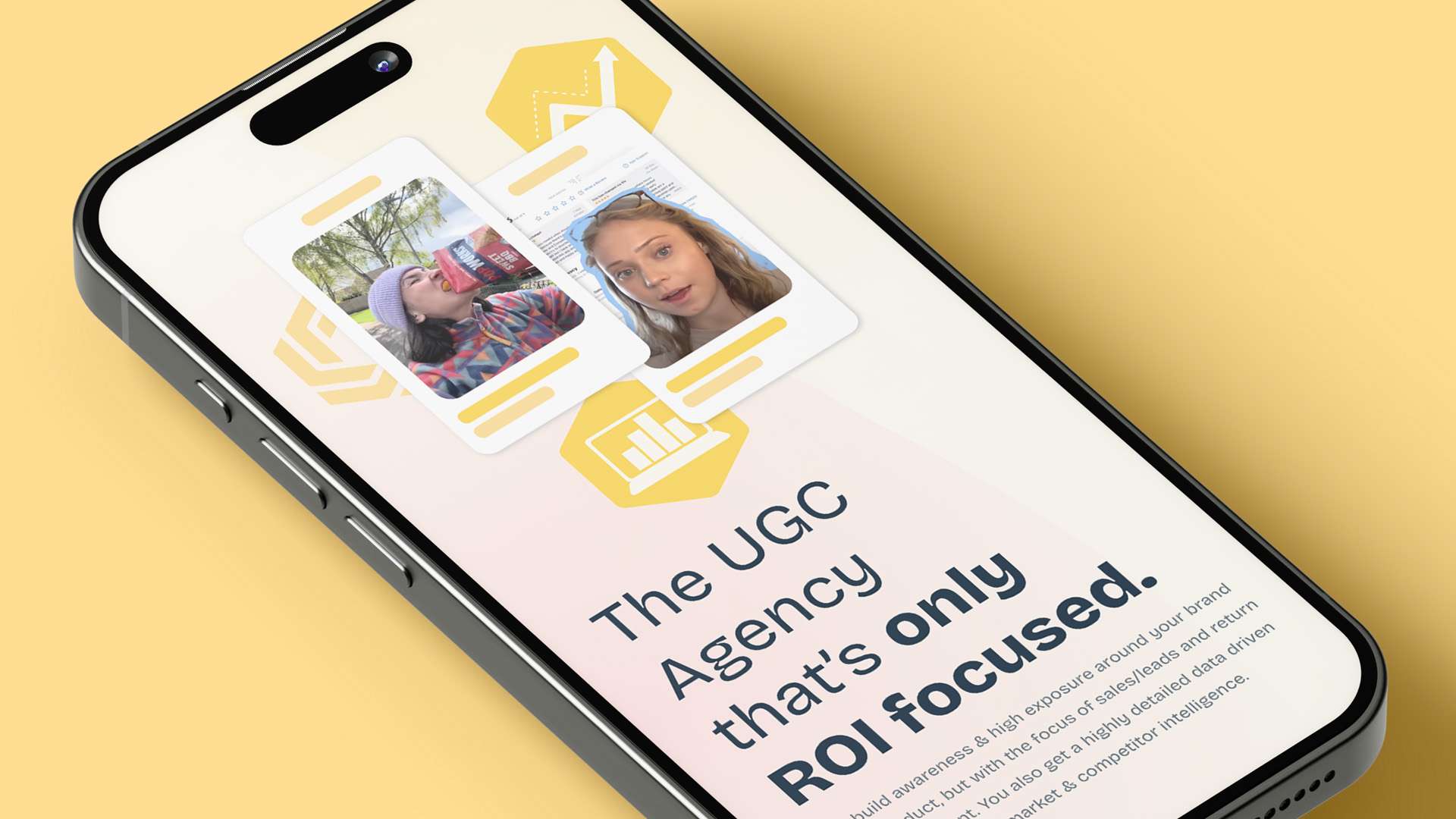
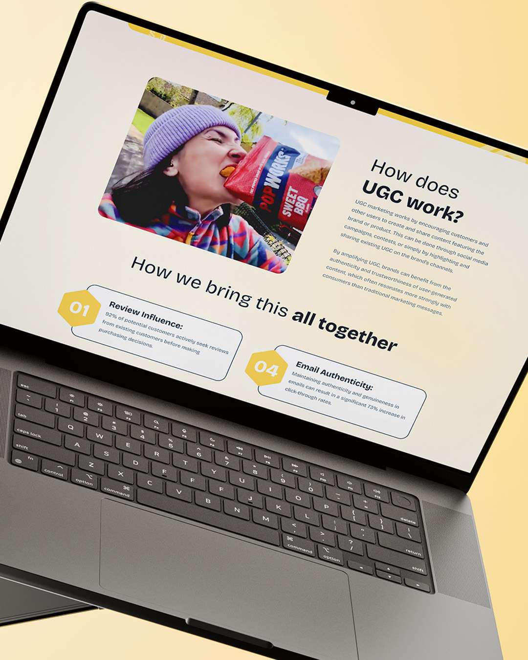
From attention to impact.
The site needed to be welcoming and informative, with case studies, campaign results and reporting data used throughout, to tell a stronger story, demonstrate the impact of the work and help brands understand the value UGC can bring to their marketing.
No projects in this category yet.
For more great work,